 Developer
 Points to check
Make sure that it's possible to interact with your interface using a keyboard only.
- Check the focus on the site using the
Tabkey to make sure that it correctly navigates between the interface elements. - Focus order between the interface elements should switch in a logical order, usually from left to right and from top to bottom. This is true for interfaces with LTR layout.
- Check if there is a visible focus indicator in your interface for all elements user can interact with.
- Check if the interaction with forms and links using the
EnterandSpacekeys works correctly. - Check that it's possible to cancel actions and close modal windows with the
Esckey - Use hotkeys on the website. Avoid overriding hotkeys. For example, don't override
Control+C(orCommand+Con Mac). - When opening a modal window, focus should move to the window, and then return back to the control that activated the modal.
TIP
Note that the components of the design system already can be operated with the keyboard, and all the sections below about working with the keyboard for specific components and interface elements describes how it already works in design system components. But everything related to the focus order and using hotkeys, you should always verify in your own interface.
Basic rules
TIP
Brief guide to keyboard control
- Tab moves
focusbetween the interactive elements on the page / in the dropdown / modal window, etc. - Shift + Tab returns
focusto the previous interactive element. - Enter, Space or ↓ (for the select/menu trigger) opens a dropdown.
Down Arrowinside the dropdown movesfocusto the nextmenuItem. From the lastmenuItem,focusmoves to the firstmenuItem. The same logic applies to theTop Arrow, but backwards 🙃- Esc discards choice or closes the dropdown / modal. If the
focuswas inside the dropdown,Escreturnsfocusto the dropdown's trigger and closes the dropdown.
Keyboard control should be performed sequentially across all interactive elements (which have focus) on the page.
- The focus state for all controls appears by pressing the
Tabkey. - For inputs and text fields, focus also appears by
onClick. - When navigating the keyboard all controls are highlighted with a blue border (see keyboard-focus tokens in Design tokens). Exceptions are inputs and text fields when validating, that on focus have same border color (orange or green).
- The focus inside groups of controls is consistent. After the last control in the group, the focus should move to the next control in the interface.
- If the control has a tooltip in the
hoverstate, it should appear on focus withTab.
Keyboard support for button, link, input, etc.
Link и hint link
- Links get focus by pressing the
Tabkey. - Links are highlighted with a blue border (see keyboard-focus tokens Design tokens).
- When you press
Enter, the link is clicked or an action is performed.
TIP
Note that links (anchor elements) are only keyboard operable by default if they have a valid href attribute.
Button
- Buttons are highlighted with a blue outline when focused on, regardless of the button color.
- When you press
Enter, the link is clicked or an action is performed.
Input и textarea
- Input fields get focus by pressing the
Tabkey. - When focused, the fields are highlighted with a blue outline. For fields that have been validated, the outline corresponds to the border color (for example, orange).
- The target action is performed by pressing
Enter(saving, applying a filter, etc.).
Checkbox, radio и switch
- Selection controls get focus when you press
Tab. - When focused, the controls are highlighted with a blue outline. For controls that have been validated, the outline corresponds to the border color (for example, orange).
- When you press
Enter, an element is checked/unchecked, depending on the initial state.
Any other controls (FilterTrigger, Pills, TabLine, etc.)
- The control gets focus when you press
Tab. - When focused, controls are highlighted with a blue outline, regardless of the color of the control.
- When you press
Enter, an event occurs. For example, a dropdown opens. - If a tooltip should appear on hovering over the control, then when pressing
Tab, it will appear when focused.
Images as links or clickable groups
- These elements get focus by pressing the
Tab. - If all elements of a group perform the same action when clicked, the entire group is highlighted as a single element when focused.
- When you press
Enter, the link is clicked or an action is performed.
Table
- Table cells should only receive keyboard focus if they are interactive. In these cases, using the
gridrole on the entire table would be more appropriate. - Controls inside the table cells get focus using
Tabonly. - Both rows and single elements in a row get
focus. Besides, the rows are presented as a list and you can move through them with arrows. And inside rows – usingTab. - When you press
Enter, an event occurs, as if you press the mouse button. If the entire row havefocus, you follow the link, and if only the icon hasfocus, then the action is performed, etc.
Keyboard support for popper
Common cases about focus behavior when working with all kind of poppers (dropdown, select, tooltip, etc.) are described below.
TIP
The trigger always has a tabIndex=0 (even when disabled) or is an input/textarea. The popper always has a tabIndex=0.
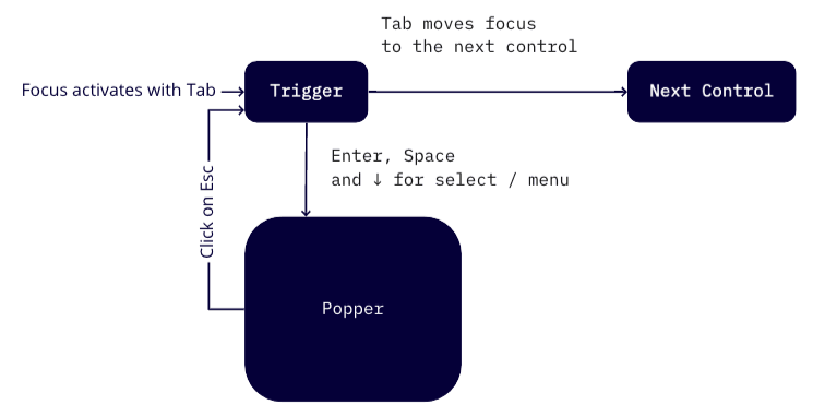
Focus, OnClick and popper
- By pressing
Tab, the trigger gets focus. - When the trigger is focused, pressing
Enter/Spaceopens a popper. - If the trigger opens the select, you can also use the
Down Arrowto move to the select's options. - Pressing
Esckey closes the popper, and focus remains on the trigger.
Shift + Tab moves focus to the previous control, and popper closes.
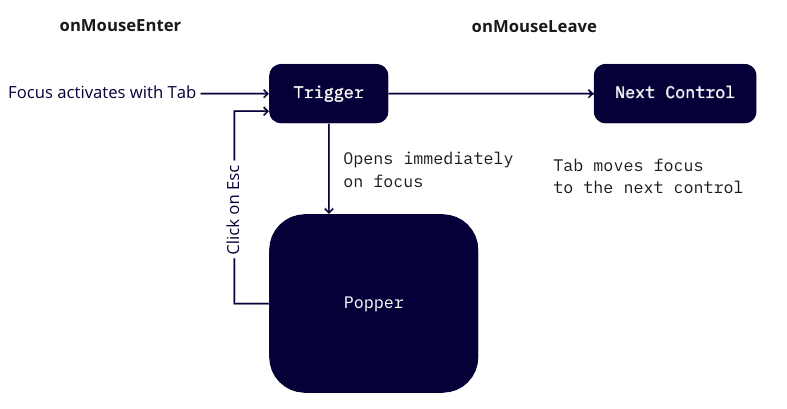
Focus, OnMouseEnter and popper
- By hovering over / pressing
Tab, the trigger gets the focus, and popper opens. - The popper closes by pressing
Esc, and focus remains on the trigger. Shift + Tabmoves focus to the previous control, and popper closes.
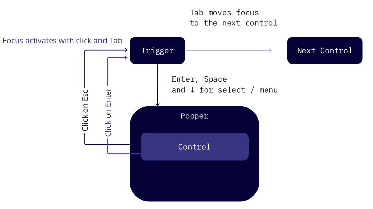
Focus, OnClick and popper with a single interactive element
- By pressing
Tab, the trigger gets focus. - When you focus on trigger,
Enter/Spaceopens a popper. If the trigger opens a select/menu, you can also open the popper by using theDown Arrow. Tabkey moves focus inside the popper to the interactive element.- Pressing
Esccloses the popper, even if the focus was on the control inside it. After closing the popper, focus returns to the trigger. - Pressing the "Submit" control inside the popper closes it and returns focus to the trigger.
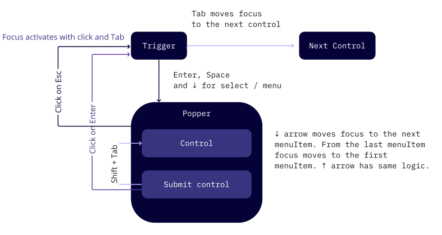
Focus, OnClick and popper with multiple interactive elements
- By pressing
Tab, the trigger gets focus. - When you focus on trigger,
Enter/Spaceopens a popper. If the trigger opens a select/menu, then you can also open the popper using theDown Arrow. Down Arrowin the menu shifts the focus to the nextmenuItem. From the lastmenuItem, the focus moves to the firstmenuItem. The same logic applies to theTop Arrowkey, but backwards 🙃Tabkey moves focus inside the popper between the interactive elements. It cycles in a circle until the popper is closed.- Pressing
Esccloses the popper, even if the focus was on the control inside it. After closing the popper, focus remains on the trigger. - Pressing the "Submit" control in the popper closes it and leaves the focus on the trigger.
Focus, onClick and popper in the popper
A popper inside another popper has the same situation as in the above case.
Keyboard support for modal window
Common cases about focus behavior when working with dropdown are described below.
- By pressing
Tab, the trigger gets focus. - When the trigger is focused, pressing
Enter/Spaceopens a modal window. - You can use
TabandShift + Tabto move between all the interactive elements inside the window. - Pressing
Esckey (orCloseicon, "Submit", or "Cancel" buttons) closes the modal window, and focus remains on the trigger.