Dropdown
Description
Dropdown is a component that displays content, such as a form or message, when triggered by a clickable item. This clickable item, also known as the trigger, can be a Button, any type of BaseTrigger, FilterTrigger, or other component.
Component composition
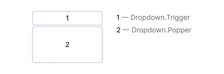
Dropdown component consists of Dropdown.Trigger and Dropdown.Popper.
Appearance
Sizes
The component doesn't have any fixed sizes since they're defined by the content inside it.
TIP
If dropdown changes its state while user interacts with it, don’t change the dropdown size (width and height).
Position
By default, the Dropdown component drops down from the trigger. However, if there isn't enough space below, it will drop in the opposite direction using Popper.js.
TIP
The Dropdown component should maintain its position relative to the trigger and not move when the page is scrolled. For instance, if the dropdown opens upward, it should remain in that position even if the user scrolls down, causing the dropdown to become partially or completely hidden.
Interaction
Dropdown opens:
- by clicking on the trigger
- by pressing
EnterorSpaceon the trigger - by typing in the input trigger
Dropdown is hidden:
- by clicking outside the dropdown
- by an action inside the dropdown (for example, by clicking the "Cancel" button)
- by pressing
Esc - when the input trigger loses
focus
Usage in UX/UI
- Don’t open dropdowns from other dropdowns
- When the dropdown is opened, the trigger should get the
activestate