Form
Description
Form is a pattern used for the collection and submission of data to the system. It consistently includes various types of inputs and controls.
Use one size for inputs and controls within the form.
Layout types
| Layout type | Example |
|---|---|
| Horizontal |  |
| Vertical |  |
| Inline |  |
Input labels
Input should have an accompanying text label.
- The font weight should be set to
regular. Useboldfont-weight sparingly for emphasizing input labels. - Omit colons after input labels.
You also could mark an input as optional.
| Input size | Vertical layout | Horizontal layout | Font size |
|---|---|---|---|
| M |  |  | 14px (--fs-200, --lh-200 tokens) |
 |  | ||
 |  | ||
| L |  |  | 16px (--fs-300, --lh-300 tokens) |
 |  | ||
 |  |
When the form is centered on the page, input labels can be aligned to the right.

Placeholders
Placeholders are necessary to guide users on the expected data input.
- Relying solely on placeholders for inputs isn't user-friendly, as the completed form can become difficult to read.
- Avoid using specific values as placeholders, as users might think the input is pre-filled.
Placeholders can be omitted when the input purpose is self-evident.
Input margins
The key unit in the design system is 4. All spacings between components and widgets should be multiples of this unit. Refer to the Spacing system for further information.
| Input size | Example |
|---|---|
| M | 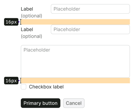 |
| L | 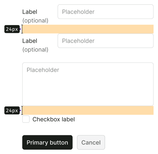 |
Form validation
Find detailed information about form validation in Validation guide.
Usage in UX/UI
Vertical form layout vs. horizontal form layout
Depending on your objectives, you can choose between vertical and horizontal form layouts.
In brief:
- Vertical layout is suitable for short and simple forms, especially on mobile screens.
- Horizontal layout is preferable for complex forms, slowing users down to reduce errors.
Vertical form layout
When to use
- The form is small and straightforward.
- Mistakes made after form completion have minimal consequences.
Advantages of vertical form layout
- Faster completion (refer to research).
- Easier scanning with the eyes.
- Ideal for multilingual interfaces.
Disadvantages of vertical form layout
- Requires more vertical space.
- Not ideal for extensive or complex forms.
Horizontal form layout, left label alignment
When to use
- The form is sizable and/or complex, warranting a slower user pace to prevent errors.
- Substantial consequences result from mistakes after completing a large form.
Advantages of horizontal form layout with left label alignment
- Can be more compact (uses less vertical space than vertical layouts).
- Attracts more user attention.
Disadvantages of horizontal form layout with left label alignment
- Requires more horizontal space.
- Takes longer to complete (read research).
- Less suitable for multilingual interfaces.
- Users who magnify their screens may struggle to match labels with inputs, given their limited screen visibility.
Horizontal form layout, right label alignment
When to use
- The form is sizable and/or complex, requiring a slower user pace to prevent errors.
- Right-aligned labels enhance the visual connection between labels and inputs, compared to left alignment.

Advantages of horizontal form layout with right label alignment
- Improved visual connection between labels and inputs.
- Higher completion rates compared to the previous layout (read research).
- Potentially more compact than vertical layouts.
Disadvantages of horizontal form layout with right label alignment
- More challenging to scan and read (labels are right-aligned, requiring more time to find the start of each line).
- Less suitable for multilingual interfaces.