Scatterplot chart
INFO
Basic data visualization rules are described in the D3 chart.
Description
Scatterplot chart displays the relationship between two variables in datasets, revealing trends, clusters, and patterns. It's useful for analyzing how two variables correlate, particularly in large datasets.
TIP
The scatterplot is highly valued for its versatility and utility in statistical graphics, praised as a significant invention in statistical graphics history (refer to Journal of the History of the Behavioral Sciences).
Use scatterplot chart when you need to:
- Identify patterns and relationships between data variables.
- Explore correlations, using bubble size and color for additional dimensions.
How to read scatterplot chart
| Case | Appearance example |
|---|---|
| If the points form a line that runs from bottom left to top right, there is likely a positive correlation between the two variables. | 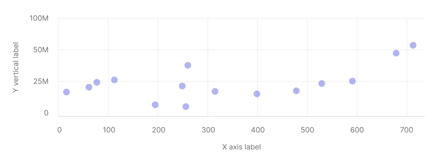 |
| If the line runs from top left to bottom right, there is likely a negative correlation between the two variables. | 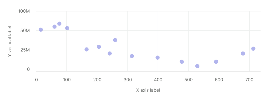 |
| If the overall trend doesn't form a clear straight line, there is probably no correlation. | 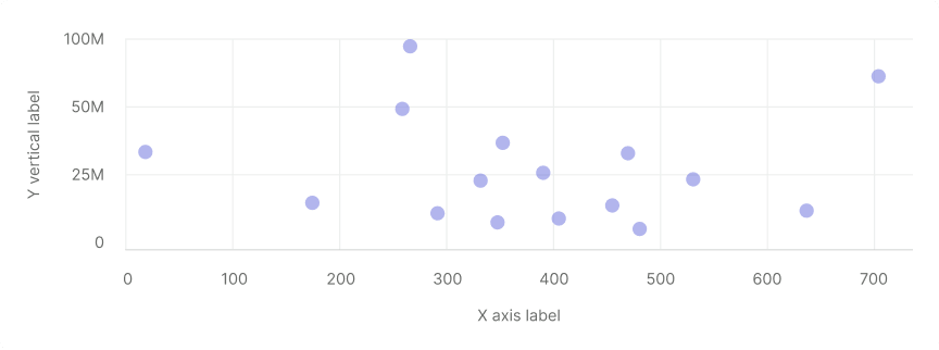 |
TIP
Correlation doesn't imply causation. Unseen variables might influence the charted data.
Appearance
Scatterplot chart should contain:
- Both vertical and horizontal lines.
- Clear labels for X and Y axes without coloring them to keep the chart readable.
- Legend for datasets with varying colors.
Dot size is 11px by 11px.
| Case | Appearance example | Styles |
|---|---|---|
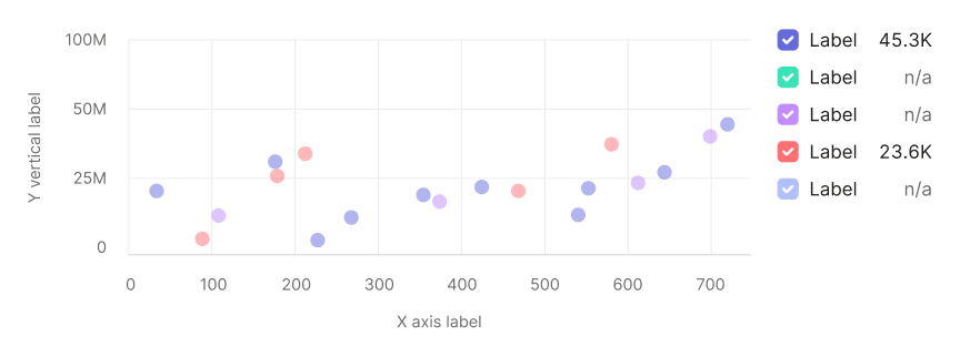
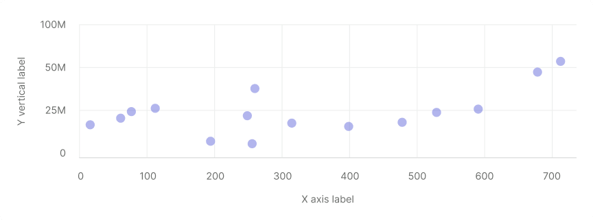
| One data set | | The default color for the category is --chart-palette-order-blue (or --blue-300) with 50% transparency. However, if necessary, you can select any other color from the chart palette. |
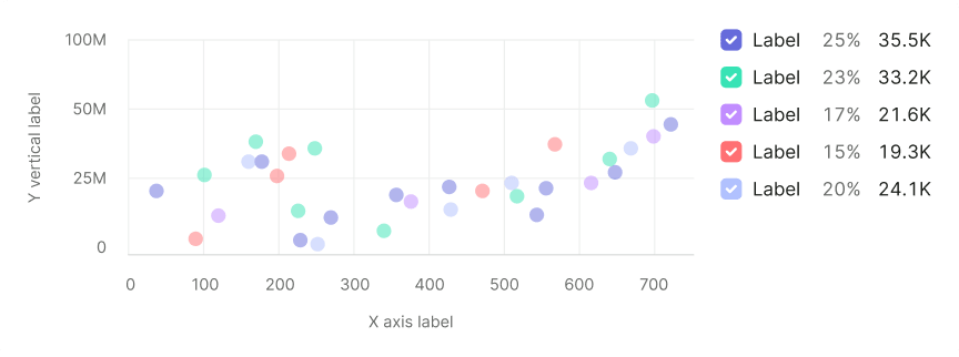
| Several data sets |  | Use colors from the chart palette. |
Value label
- Dot size: 24px by 24px.
- Text size: 12px.
Display values over 100 as "99+". Use a darker shade for text color than the dot color (for example, if dot has --blue-300 color, then use --blue-400 color for the label).
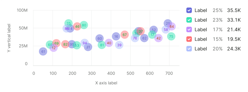
Legend
Add a legend for charts with multiple datasets, favoring a vertical layout for easier reading and values comparing.
Interaction
- Dots increase opacity to 80% on hover, displaying values.
- Change the cursor to a
pointerfor clickable dots.
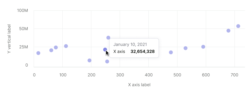
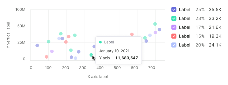
Tooltip
Tooltips should highlight:
- X-axis and Y-axis values.
- Focus on values rather than axis names or categories.
- Include dataset colors in tooltips for charts with multiple datasets.
| Case | Appearance example |
|---|---|
| One data set | |
| Several data sets | |
Edge cases
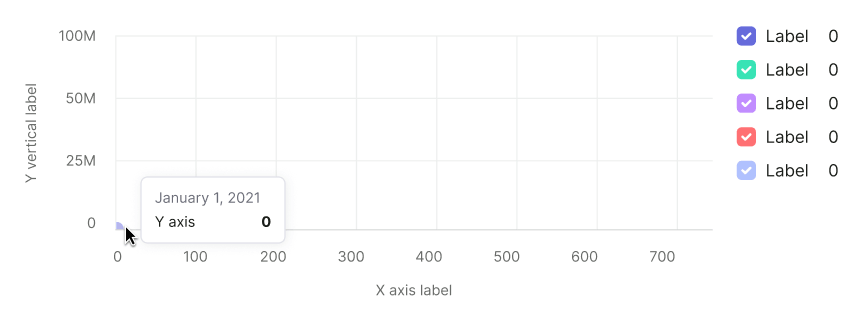
Null data
Zero values are displayed at the origin, with legend reflecting zero data.
TIP
Zero counts as data. 0 ≠ n/a.
No data
Omit points without data on the chart and reflect this in the legend.
Bubbles near axes
The chart will scale automatically if the bubble is near the axes.
Initial data loading
Show Skeleton during initial loading. If the chart has a title, display it to inform users about what's loading. Refer to Skeleton for more details.
Use the --skeleton-bg color token for the skeleton's background.

Refer to Error & n/a widget states for all other empty states.
Usage in UX/UI
Axes
Label both the X and Y axes. Avoind coloring the axis labels, this can make the data harder to read.

Y-axis strating point
Always start the Y-axis at 0 to avoid visual distortion of data correlation.

Data sets number
Limit the number of datasets to keep the chart readable.
