 Developer
 Description
Informer is a pattern used to show rich tooltips within the interface. It's useful when there is limited space to add, for example, a hint link alongside a component.
Appearance
The informer consists of the following elements:
Infoicon withmargin-left: 4px- Tooltip with the message (appears on clicking or pressing Enter/Space on the icon)
TIP
Avoid using the Info icon with the h1 title. This title typically pertains to hero blocks and similar elements. Adding tooltips to the main page title might seem unusual.
| Font size | Icon size | Usage |
|---|---|---|
36px (--fs-700), 32px (--fs-600) | L | Use exclusively for the largest titles and controls. 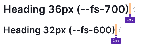 |
Smaller than 24px (--fs-500) | M | Suitable for text sizes smaller than 24px. 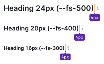   |
Interaction
| State | Appearance example | Styles |
|---|---|---|
| Normal |  | color: var(--intergalactic-icon-secondary-neutral) |
| Hover, active |  | color: var(--intergalactic-icon-secondary-neutral-hover-active), cursor: pointer. |
Click zone
| Icon size | Target zone size | Appearance example |
|---|---|---|
| L | 24px * 24px |  |
| M | 16px * 16px |  |
Tooltip
For comprehensive details, refer to Tooltip.
Usage in UX/UI
When the Info icon contains supplementary information about a control within a group of controls (for example, filters), pay attention to margins.
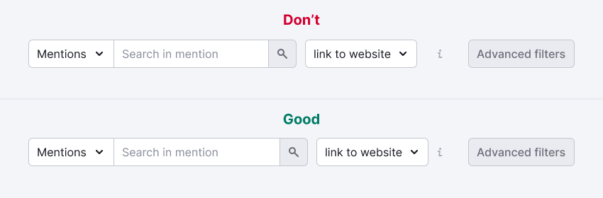
When controls are accompanied by text labels, position the Info icon adjacent to the labels.
