 Developer
 Description
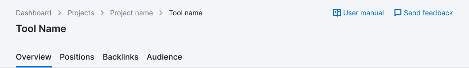
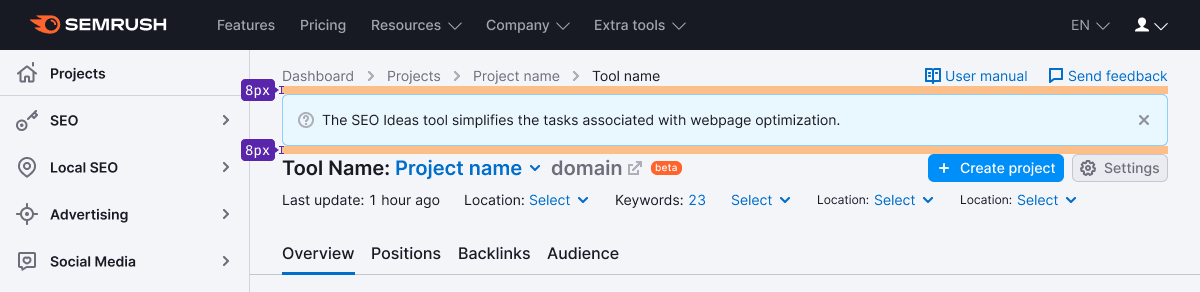
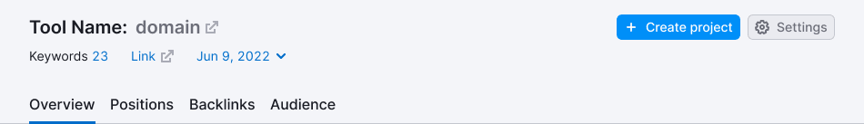
ProductHead is a comprehensive composed component that contains all common controls, CTAs, and filters for data filtering in the product's reports.
It is always positioned below the main Semrush header and searchbar.
Component composition
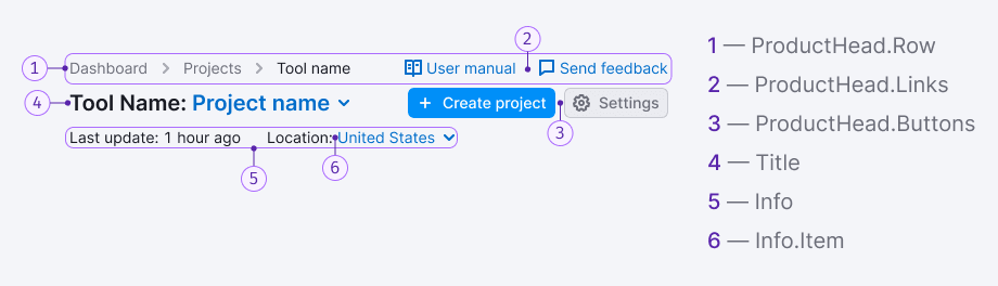
The report header includes the following:
ProductHead.Row: The header is divided into rows with components, and they are separated from each other by equal paddings.ProductHead.Links: They are usually placed at the top right of the header, refer to Additional links pattern.ProductHead.Buttons.Title: It's a name of the product and the project. Can have additional controls for customizing the product or performing additional actions.Info: It's a row with global filters and/or additional information.Info.Item: An item with the information on the project or global filter.
Margins and paddings
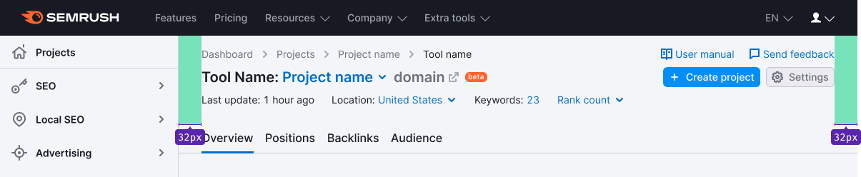
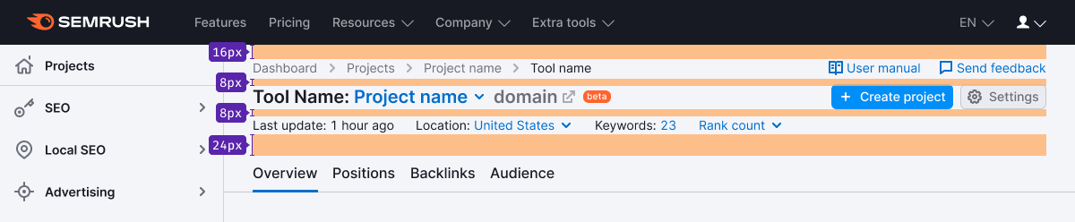
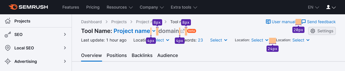
If there is a Notice in the header, it has an 8px margin-bottom to the elements in ProductHead.
Margins between the elements
Styles
Breadcrumbs and additional links
- Breadcrumbs and additional links are center-aligned.
- Links have a size of 14px.
- The margin between the links is 20px.
Heading and main controls
- The heading, buttons, and labels are center-aligned with respect to each other.
- For the title, use text with a size of 20px (use
--fs-400,--lh-400tokens). - Use
--text-primarytoken for the text color, and for the project's name, use--text-secondarytoken. - The size of nearby icons should be M. For icon color, use the
--icon-secondary-neutraltoken. - The icons are aligned with the title's baseline.
- Button has a size of M.
Filters and/or additional information
- All elements are center-aligned.
- For text, use a size of 14px (use
--fs-200,--lh-200tokens) and--text-primarytoken for the color. - Icons have a size of M.
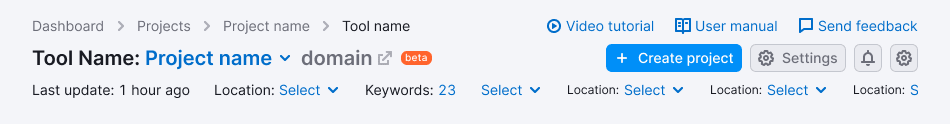
ProductHead variants
Maximum set of elements inside
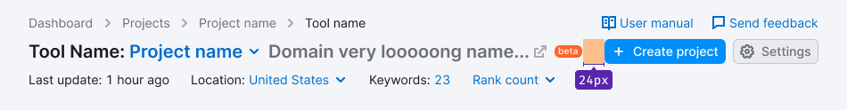
TIP
When the domain and/or project names are too long and don't fit in the intended place, collapse them into an ellipsis. If you have controls on the right, add a “protective” left margin of 24px.
Global filters or additional information
No global filters, additional information or tabs
In these cases, the margin between the row with the product's title and the TabLine/Divider is 16px.