 Developer
 Font
In our design system, we use the Inter font family.
Basic text colors
To specify the main text color, use the --text-primary token.
For the secondary text color, utilize the --text-secondary token.
Additionally, both paragraphs, headings, and text can be colored with our main semantic colors, which include --text-success, --text-critical and others.
Please use text coloring thoughtfully and avoid excessive use, as it may reduce readability. Always ensure text contrast against its background.
Font size and line height
| px | em | Font size tokens | Line height tokens |
|---|---|---|---|
| 48px | 3em | --fs-800 | --lh-800 |
| 36px | 2.25em | --fs-700 | --lh-700 |
| 32px | 2em | --fs-600 | --lh-600 |
| 24px | 1.5em | --fs-500 | --lh-500 |
| 20px | 1.25em | --fs-400 | --lh-400 |
| 16px | 1em | --fs-300 | --lh-300 |
| 14px | 0.875em | --fs-200 | --lh-200 |
| 12px | 0.75em | --fs-100 | --lh-100 |
import React from 'react';
import { Text } from 'intergalactic/typography';

const Demo = () => (
  <div>
    <Text size={800} tag='p' mb={6} mt={0}>
      48px / 3em / --fs-800,--lh-800
    </Text>
    <Text size={700} tag='p' mb={4} mt={0}>
      36px / 2.25em / --fs-700,--lh-700
    </Text>
    <Text size={600} tag='p' mb={4} mt={0}>
      32px / 2em / --fs-600,--lh-600
    </Text>
    <Text size={500} tag='p' mb={3} mt={0}>
      24px / 1.5em / --fs-500,--lh-500
    </Text>
    <Text size={400} tag='p' mb={2} mt={0}>
      20px / 1.25em / --fs-400,--lh-400
    </Text>
    <Text size={300} tag='p' mb={1} mt={0}>
      16px / 1em / --fs-300,--lh-300
    </Text>
    <Text size={200} tag='p' mb={1} mt={0}>
      14px / 0.875em / --fs-200,--lh-200
    </Text>
    <Text size={100} tag='p' mb={1} mt={0}>
      12px / 0.75em / --fs-100,--lh-100
    </Text>
  </div>
);

export default Demo;
import React from 'react';
import { Text } from 'intergalactic/typography';
const Demo = () => (
<div>
<Text size={800} tag='p' mb={6} mt={0}>
48px / 3em / --fs-800,--lh-800
</Text>
<Text size={700} tag='p' mb={4} mt={0}>
36px / 2.25em / --fs-700,--lh-700
</Text>
<Text size={600} tag='p' mb={4} mt={0}>
32px / 2em / --fs-600,--lh-600
</Text>
<Text size={500} tag='p' mb={3} mt={0}>
24px / 1.5em / --fs-500,--lh-500
</Text>
<Text size={400} tag='p' mb={2} mt={0}>
20px / 1.25em / --fs-400,--lh-400
</Text>
<Text size={300} tag='p' mb={1} mt={0}>
16px / 1em / --fs-300,--lh-300
</Text>
<Text size={200} tag='p' mb={1} mt={0}>
14px / 0.875em / --fs-200,--lh-200
</Text>
<Text size={100} tag='p' mb={1} mt={0}>
12px / 0.75em / --fs-100,--lh-100
</Text>
</div>
);
export default Demo;Headings
Our design system offers six heading sizes.
The first four headings are typically used for hero blocks, large advertising screens, banners, and landing pages. Use the semibold font-weight (--semi-bold token) with these headings.
| Appearance | Styles | Tokens |
|---|---|---|
 | font-size: 48px, line-height: 1.17, font-weight: semibold | --fs-800, --lh-800 |
 | font-size: 36px, line-height: 1.11, font-weight: semibold | --fs-700, --lh-700 |
 | font-size: 32px, line-height: 1.25, font-weight: semibold | --fs-600, --lh-600 |
 | font-size: 24px, line-height: 1.17, font-weight: semibold | --fs-500, --lh-500 |
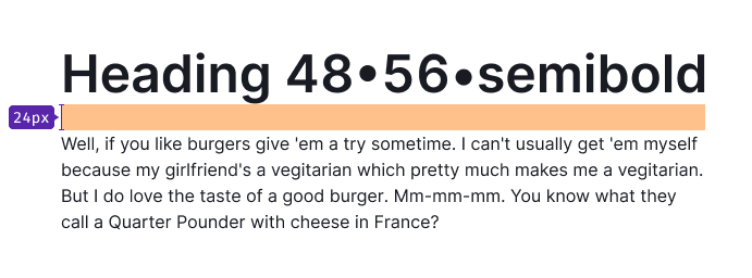
The remaining headings are used for the content part of products and landing pages. For headings with a size of 16px and smaller, use the bold font-weight (--bold token).
| Appearance | Styles | Tokens |
|---|---|---|
 | font-size: 20px, line-height: 1.2, font-weight: semibold | --fs-400, --lh-400 |
 | font-size: 16px, line-height: 1.5, font-weight: bold | --fs-300, --lh-300 |
Heading with counter
In certain cases, headings can include additional information, such as a counter of results found. These are often used in table headings. In such cases, the additional information is presented using the secondary text (--text-secondary token) and regular font-weight (--regular token).

Headings for mobile devices
To improve readability on different screens, adjust the size of headings based on the breakpoints.
TIP
Only change font styles, not the markup.
| 0px – 768px | 768px – ∞ |
|---|---|
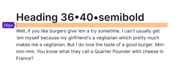
36/40 – --fs-700, --lh-700 | 48/56 – --fs-800, --lh-800 |
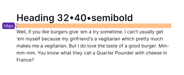
32/40 – --fs-600, --lh-600 | 36/40 – --fs-700, --lh-700 |
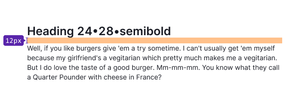
24/28 – --fs-500, --lh-500 | 32/40 – --fs-600, --lh-600 |
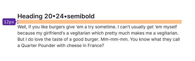
20/24 – --fs-400, --lh-400 | 24/28 – --fs-500, --lh-500 |
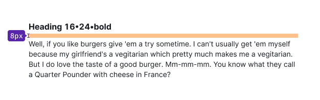
16/24 – --fs-300, --lh-300 | 20/24 – --fs-400, --lh-400 |
14/20 – --fs-200, --lh-200 | 16/24 – --fs-300, --lh-300 |
Paragraph
There are three text sizes commonly used in our products:
16px text
14px text
12px text
import React from 'react';
import { Text } from 'intergalactic/typography';

const Demo = () => (
  <div>
    <Text size={300} tag='p' mb={4} mt={0}>
      Paragraph 16px / 1em / --fs-300,--lh-300
    </Text>
    <Text size={200} tag='p' mb={3} mt={0}>
      Paragraph 14px / 0.875em / --fs-200,--lh-200
    </Text>
    <Text size={100} tag='p' mb={2} mt={0}>
      Paragraph 12px / 0.75em / --fs-100,--lh-100
    </Text>
  </div>
);

export default Demo;
import React from 'react';
import { Text } from 'intergalactic/typography';
const Demo = () => (
<div>
<Text size={300} tag='p' mb={4} mt={0}>
Paragraph 16px / 1em / --fs-300,--lh-300
</Text>
<Text size={200} tag='p' mb={3} mt={0}>
Paragraph 14px / 0.875em / --fs-200,--lh-200
</Text>
<Text size={100} tag='p' mb={2} mt={0}>
Paragraph 12px / 0.75em / --fs-100,--lh-100
</Text>
</div>
);
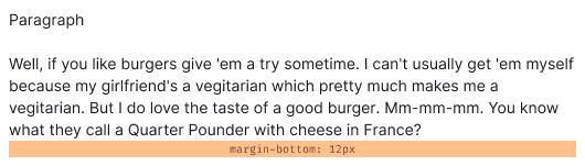
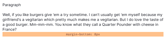
export default Demo;Paragraph margins
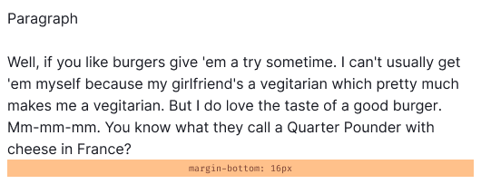
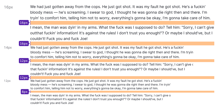
Paragraphs have a margin-bottom, and each paragraph size has its own specific margin. For instance, a paragraph with a 16px font size has a margin-bottom: 14px, a paragraph with a 14px font size has a margin-bottom: 12px, and a paragraph with a 12px font size has a margin-bottom: 8px.
These margins can also be applied when a paragraph is followed by a paragraph with a smaller font size.
Metric
For highlighting metrics in your interface, use the following styles:
| px | Tokens | Appearance |
|---|---|---|
| 32px | --fs-600, --lh-600 |  |
| 24px | --fs-500, --lh-500 |  |
| 20px | --fs-400, --lh-400 |  |
| 16px | --fs-300, --lh-300 |  |
| 14px | --fs-200, --lh-200 |  |
import React from 'react';
import { Text } from 'intergalactic/typography';
import { Box } from 'intergalactic/flex-box';

const Demo = () => (
  <div>
    <Text size={600} tag='strong' mb={4} mt={0}>
      Metric 32px / 2em / --fs-600,--lh-600
    </Text>
    <Box h={8} />
    <Text size={500} tag='strong' mb={3} mt={0}>
      Metric 24px / 1.5em / --fs-500,--lh-500
    </Text>
    <Box h={8} />
    <Text size={400} tag='strong' mb={2} mt={0}>
      Metric 20px / 1.25em / --fs-400,--lh-400
    </Text>
    <Box h={8} />
    <Text size={300} tag='strong' mb={1} mt={0}>
      Metric 16px / 1em / --fs-300,--lh-300
    </Text>
    <Box h={8} />
    <Text size={200} tag='strong' mb={1} mt={0}>
      Metric 14px / 0.875em / --fs-200,--lh-200
    </Text>
  </div>
);

export default Demo;
import React from 'react';
import { Text } from 'intergalactic/typography';
import { Box } from 'intergalactic/flex-box';
const Demo = () => (
<div>
<Text size={600} tag='strong' mb={4} mt={0}>
Metric 32px / 2em / --fs-600,--lh-600
</Text>
<Box h={8} />
<Text size={500} tag='strong' mb={3} mt={0}>
Metric 24px / 1.5em / --fs-500,--lh-500
</Text>
<Box h={8} />
<Text size={400} tag='strong' mb={2} mt={0}>
Metric 20px / 1.25em / --fs-400,--lh-400
</Text>
<Box h={8} />
<Text size={300} tag='strong' mb={1} mt={0}>
Metric 16px / 1em / --fs-300,--lh-300
</Text>
<Box h={8} />
<Text size={200} tag='strong' mb={1} mt={0}>
Metric 14px / 0.875em / --fs-200,--lh-200
</Text>
</div>
);
export default Demo;Text styles
You have the flexibility to change the style of text by making it bold, italic, adding a link component, a hint component, or applying strikethrough.
import React from 'react';
import { Hint, Text } from 'intergalactic/typography';

const Demo = () => (
  <div>
    <Text size={300} tag='p' mb={2} mt={0}>
      But I do love the taste of a <Text tag='strong'>good burger</Text>. Mm-mm-mm.
    </Text>
    <Text size={300} tag='p' mb={2} mt={0}>
      But I do love the taste of a <Text tag='em'>good burger</Text>. Mm-mm-mm.
    </Text>
    <Text size={300} tag='p' mb={2} mt={0}>
      But I do love the taste of a <Text color='text-success'>good burger</Text>. Mm-mm-mm.
    </Text>
    <Text size={300} tag='p' mb={2} mt={0}>
      But I do love the taste of a <Hint>good burger</Hint>. Mm-mm-mm.
    </Text>
    <Text size={300} tag='p' mb={2} mt={0}>
      But I do love the taste of a <Text tag='s'>good burger</Text>. Mm-mm-mm.
    </Text>
    <Text size={300} tag='p' mb={2} mt={0} monospace>
      monospace text
    </Text>
    <Text size={300} tag='p' mb={2} mt={0} uppercase>
      uppercase text
    </Text>
    <Text size={300} tag='p' mb={2} mt={0} capitalize>
      capitalize text
    </Text>
    <Text size={300} tag='p' mb={2} mt={0} lowercase>
      LOWERCASE TEXT
    </Text>
  </div>
);

export default Demo;
import React from 'react';
import { Hint, Text } from 'intergalactic/typography';
const Demo = () => (
<div>
<Text size={300} tag='p' mb={2} mt={0}>
But I do love the taste of a <Text tag='strong'>good burger</Text>. Mm-mm-mm.
</Text>
<Text size={300} tag='p' mb={2} mt={0}>
But I do love the taste of a <Text tag='em'>good burger</Text>. Mm-mm-mm.
</Text>
<Text size={300} tag='p' mb={2} mt={0}>
But I do love the taste of a <Text color='text-success'>good burger</Text>. Mm-mm-mm.
</Text>
<Text size={300} tag='p' mb={2} mt={0}>
But I do love the taste of a <Hint>good burger</Hint>. Mm-mm-mm.
</Text>
<Text size={300} tag='p' mb={2} mt={0}>
But I do love the taste of a <Text tag='s'>good burger</Text>. Mm-mm-mm.
</Text>
<Text size={300} tag='p' mb={2} mt={0} monospace>
monospace text
</Text>
<Text size={300} tag='p' mb={2} mt={0} uppercase>
uppercase text
</Text>
<Text size={300} tag='p' mb={2} mt={0} capitalize>
capitalize text
</Text>
<Text size={300} tag='p' mb={2} mt={0} lowercase>
LOWERCASE TEXT
</Text>
</div>
);
export default Demo;List
| px | Tokens | Styles | Numbered list | Unordered list | Check list |
|---|---|---|---|---|---|
| 16px | --fs-300, --lh-300 | margin-bottom: 8px, padding-right: 8px |  |  |  |
| 14px | --fs-200, --lh-200 | margin-bottom: 8px, padding-right: 8px |  |  |  |
| 12px | --fs-100, --lh-100 | margin-bottom: 8px, padding-right: 8px |  |  |  |
Nested list
Each subsequent level of the nested list is indented to the left. The margin between list levels for all font sizes are 8px.
| px | Tokens | Margins |
|---|---|---|
| 16px | --fs-300, --lh-300 | 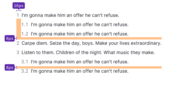 |
| 14px | --fs-200, --lh-200 | 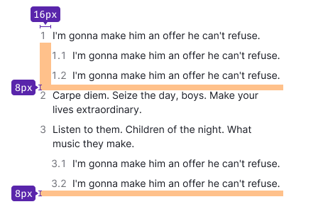 |
| 12px | --fs-100, --lh-100 |  |
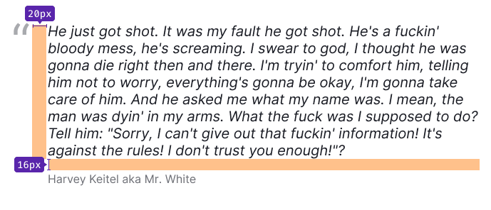
Quote
We have specific styles for highlighting quotes in paragraphs.
Hints (hint links)
Text can be wrapped in a hint link (pseudo-link) component, creating a control that triggers events on the page without reloading it. This pseudo-link is usually used to show and hide tooltips or parts of the UI.

Hint link states
| State | Appearance example | Styles and tokens | Cursor |
|---|---|---|---|
| Normal |  | --text-hint and underlined with dashed border-bottom. | help or pointer, if clickable |
| Active/hover |  | --text-hint-hover-active and underlined with dashed border-bottom. If used with an icon, the icon changes color along with the text. | help, default or pointer (depending on the usage context) |
| Disabled |  | --disabled-opacity. Use this state as a last resort and be sure to label the disabled link with an explanatory tooltip. | default |
| visited | This link does not have visited state. |
Which heading with which paragraph size shall be used
Use a 16px paragraph with the following headings:
Use a 14px paragraph with the following headings: