INFO
Basic data visualization rules are described in the D3 chart.
Description
Venn chart illustrates how different data sets relate and overlap. It's also known as a set chart.
- Each circle represents a data set.
- Overlapping areas called "intersection area" show common elements across data sets.
- This chart type focuses on how much different groups of sets have in common (or how different they are).
TIP
Venn charts can become cluttered with more than two data sets.
When to use venn chart?
- To show data set relationships and differences.
- To compare data sets, highlighting commonalities.
- To show boolean logic like "or" and "and" for data sets.
TIP
John Venn came up with this type of chart around 1880. They were used in the study of set theory as they excellently illustrated the relations of different groups.
Appearance
All circles have 50% fill opacity and 2px stroke.
Sizes
- Minimum: 180px by 180px.
- Maximum: 300px by 300px.
Avoid sizes outside the minimum limits, because For too small venn chart, the intersection area may be very small and, consequently, invisible.
Legend
Add a legend with values for clarity.
| Appearance example | |
|---|---|
| Chart inside small widgets (< 400px) |  |
| Chart inside large widgets (> 400px) | 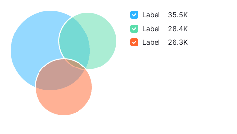 |
General recommendations
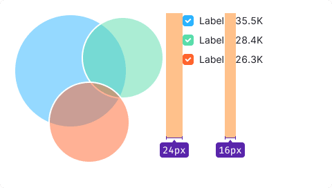
- Keep legend close to the chart, max 24px away.
- Legend labels should have a 16px margin-right.
- Align legends to the top of the chart.
- If it doesn't fit, place it below the chart with a 24px margin.

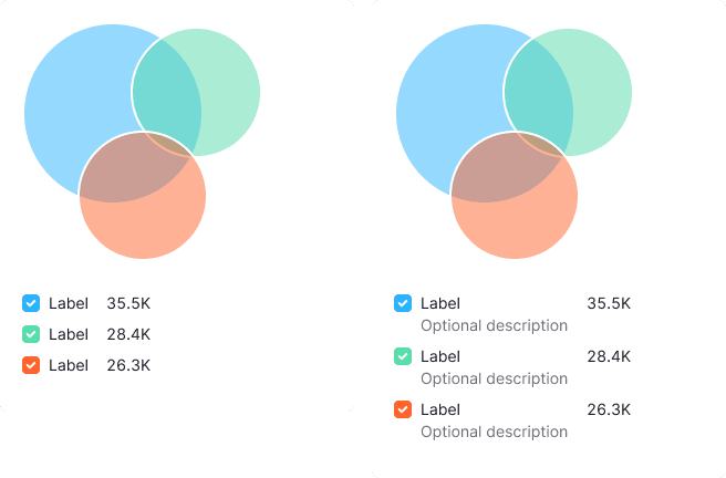
Legend content
Use --text-secondary color for data set names and their descriptions.
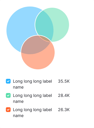
Long label
Wrap long labels onto the next line.
Interaction
| State | Appearance example | Styles |
|---|---|---|
| Default | | 50% fill transparency and 2px stroke size. |
| Hover | 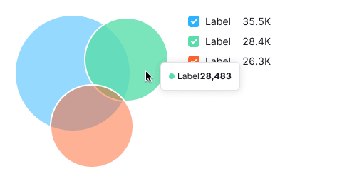 | Hovered sector fill increases to 70% opacity. |
Tooltip
Show data set names and values, including intersection details and percentages.
| Appearance example | Tooltip content | |
|---|---|---|
| Hover over a sector | | Show name of the data set and its value. |
| Hover over an intersection area | 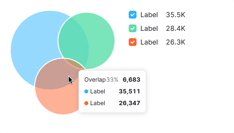 | Display the intersection percentage and its value. List the names and values of intersecting sectors below. |
Edge cases
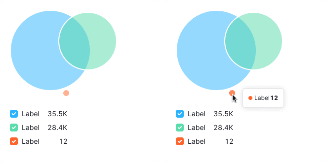
Value less than 1%
Display the smallest circle possible (12px by 12px).
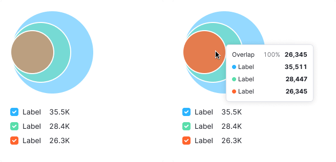
Intersection 100%
Align data sets to the left.
Null values
If the data set value is zero, don't show it on the chart, but show the value in the legend.
TIP
Zero counts as data. 0 ≠ n/a.

If all data set values are zero, display a circle in --chart-palette-order-null color.

No data
Exclude unavailable data from the chart, marking it as n/a in the legend. If all dataset values are unknown, show a circle in --chart-palette-order-null color.

Initial data loading
Show Skeleton during initial loading. If the chart has a title, display it to inform users about what's loading. Refer to Skeleton for more details.
Use the --skeleton-bg color token for the skeleton's background.

Refer to Error & n/a widget states for all other empty states.