Description
Primary table is the foundational table type for displaying large data volumes and complex functionality.
Appearance
Paddings
In the primary table, whether it's a header or a row, cells use --spacing-3x token for padding.
You can also make a cell more compact by using the compact property, which reduces the left and right paddings to --spacing-2x.
Styles
TIP
Content inside header cells and rows is always aligned to the top.
| Description | Appearance | Styles |
|---|---|---|
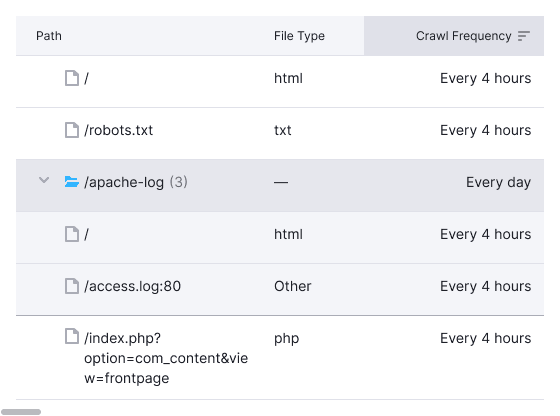
| Header | background-color: var(--table-th-primary-cell), border-bottom: 1px solid var(--border-secondary) | |
| Header of the scrollable table | When scrolling a page with a table, the header shouldn't have a shadow. | |
| Default row | border-bottom: 1px solid var(--border-secondary) | |
| The last line of the accordion |  | border-bottom: 1px solid var(--table-td-cell-actions-accordion) |
Multi-level header
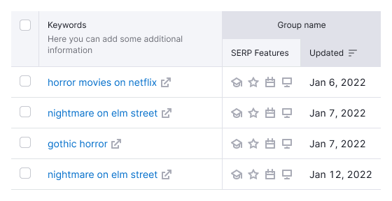
In some cases, a header may comprise two or more rows. To maintain consistency:
- The title of the merged column should always be center-aligned.
- Sorting is not available for the parent header cells in multi-level headers.

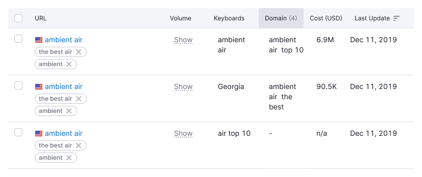
In other cases, when space is limited, wrap text to the next line within the cell.

Table header states
| State | Appearance | Tokens |
|---|---|---|
| Hover | Use --table-th-primary-cell-hover for background color. | |
| Sorted | Use --table-th-primary-cell-active for background color. |
Row states
For more information, refer to the general DataTable guide.