Histogram
INFO
Basic data visualization rules are described in the D3 chart.
Description
Histogram groups numeric data to compare it by quantity. It's good for showing the distribution of values.
Key points for using histogram:
- Start the Y-axis at zero.
- Make sure the chart title explains the axes. Add labels if needed.
- Use a single color or similar shades for simplicity.
- Consider horizontal histogram for long range names or many ranges.
Histogram vs. Bar chart
- Histogram shows quantitative data distribution. Each bar represents a range of numerical values, such as age. The bar length shows how many values fall into that range.
- Bar chart displays qualitative data distribution, with bars representing nominal categories, such as countries. Unlike histograms, bar charts have visual gaps between bars to emphasize the discrete character of the categories.

Appearance
Color
- Stick to the color palette guidelines.
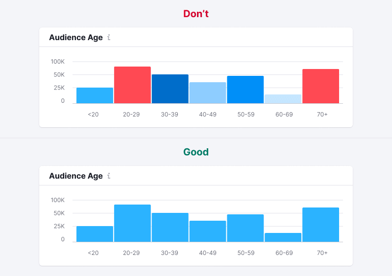
- Normally, all bars should be the same color. Use different colors only if it's helpful for understanding the data.
Bar order
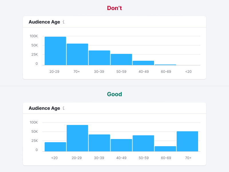
Organize values logically, such as largest to smallest, or chronologically for months.
TIP
Avoid ordering histogram bars by length—it makes the chart hard to read.
Handling outliers
Sometimes data values vary widely. Showing such data as is can skew perception towards larger values, making others seem insignificant.
TIP
Bars have a minimum height of 2px to ensure visibility next to very large values.

A logarithmic scale can help balance the representation of data ranges. Possible solutions for such case are described in the Handling outliers section for Bar chart.
Legend and axes
Usually, histograms don't need a legend. Just clearly name the chart and possibly label the axes.

Interaction
Hovering highlights a column with --chart-grid-bar-chart-hover, indicating focus or clickability. For trend lines, display corresponding points on hover.

Edge cases
Data for one range
Display a single bar for single-range data.

Null values
Show zero in tooltips for all-zero data.
TIP
Zero values count as data and are different from "n/a".

No data
Don't display bars for ranges without values. When hovering over such ranges, show a tooltip with the "n/a" value. Additionally, consider adding a message explaining the absence of data and providing information on when it will be available (if possible).
Initial data loading
Show Skeleton during initial loading. If the chart has a title, display it to inform users about what's loading. Refer to Skeleton for more details.
Use the --skeleton-bg color token for the skeleton's background.

Usage in UX/UI
Bars should always begin from zero to avoid misleading comparisons. Incorrect scaling can create illusions of proportion, making one value seem half as large as another when it's not.
