 Developer
 Description
D3 chart components offer various chart types and tools for data visualization.
Refer to Charts showcase, to explore all charts and pick the best one for your needs.
Grid and axes
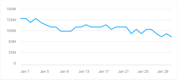
Axes help users understand data relationships and navigate through data. A plot can include horizontal and vertical lines.
| Appearance example | When to use | |
|---|---|---|
| Horizontal lines |  | Use with charts showing data trends over time. |
| Both horizontal and vertical lines |  | Use with scatter plots and bubble charts. |
| Vertical lines |  | Use with horizontal bar charts. |
Basic styles for Chart.Plot:
- The Y-axis is hidden by default.
- Additional axes are colored with
--chart-grid-linetoken. - X-axis and additional active lines on the grid (if needed) have
--chart-grid-x-axiscolor.
TIP
Keep additional lines dim to focus on data.
Margins
- Y-axis values have 16px left and right margins.
- X-axis values have a 12px top margin.


Reference line
You can show different reference lines (highlight date or dates range) to guide user through your data visualization.

Minimum and maximum axes' number
Use 3-5 horizontal additional horizontal lines for clarity. Use rounded values on axes, for example, 25K, 20K, 15K, 10K.
TIP
The recommended minimum chart height is 120px. For such a chart, it's advisable to display 3 additional horizontal guides. Keep in mind that small charts might make it hard to see data changes.
It's recommended for smal charts having no more than 3 horizontal lines.

The maximum chart height depends on your specific case. For charts with greater heights, use no more than 5-6 additional horizontal lines.
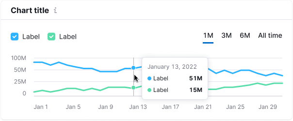
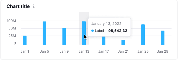
Tooltip
Tooltips show data when hovering over chart parts, even if no data is present (use "n/a" in this case).
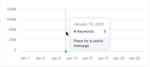
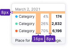
The tooltip aligns with the cursor with a 4px margin within the chart area.
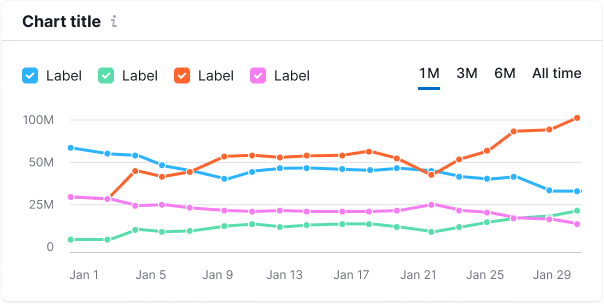
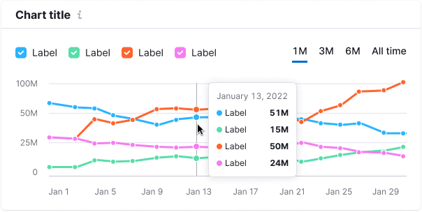
- It shows data for all lines for a selected date.
- Align tooltip values to the right for easy comparison.
- Include total values in the tooltip.
- Synchronize tooltips across charts for data comparison.
TIP
Avoid measurement units in tooltips unless needed for clarity. However, in more complex charts, such as scatterplots, adding a measurement unit can enhance data reading.
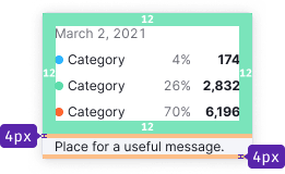
Tooltip styles
Tooltip padding is always 12px.
Edge cases
Not available data
Represent missing data with a dashed line.
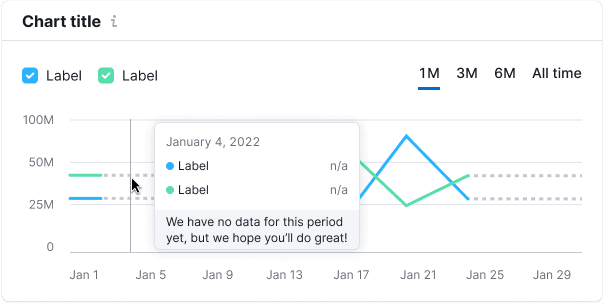
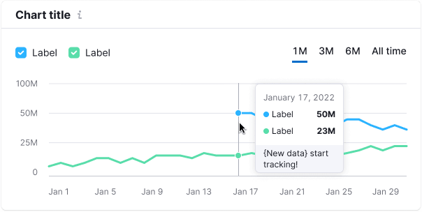
Start of data collecting
Use a solid line for new data. The tooltip should mention the start of data collection, use --chart-grid-y-accent-hover-line token for the text color.
Dots
| Appearance | Styles |
|---|---|
  | Default dot size is 8px * 8px. The dot's size in hovered state is 10px * 10px. |
 | Color for the additional vertical line that appears on line charts when hovering is --chart-grid-y-accent-hover-line. |
 | Background color for hovering bar charts is --chart-grid-bar-chart-hover. |
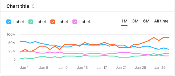
Legend
Legend explains chart data and can act as filters. For detailed information, refer to Chart legend.
Usage with Card
In our design system, data is typically placed within a Card, which consists of the Card.Header and Card.Body.
Chart title
Every chart needs a clear title. If the title is far from the chart, ensure clear margins. Make titles clickable and use an Info icon for additional details.
For the chart title, use 16px text (--fs-300, --lh-300, font-weight: var(--bold)) and --text-primary token for color. M size Info icon has --icon-secondary-neutral color and margin-left: 4px. Hover state for the clickable title matches link styles.
Chart description
You can add a description text to your chart. Typically, such a text can provide information on maximum/minimum data statuses, explains the data source, or offers insightful advice related to visualized data.
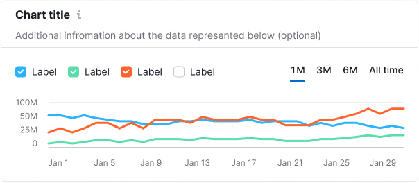
For the description text, use 14px text (--fs-200, --lh-200) and --text-secondary token for color.
Initial data loading
During the initial data loading, display the Skeleton instead of the chart.
If the chart has a title, it should be displayed during the initial loading. The user should be aware of what is being loaded, and whether they need to wait for the process to complete.
TIP
Each chart type has a specific skeleton. Refer to type-specific guides.
Edge cases
Edge cases vary by chart type. Check the specific chart documentation for details. For empty states, refer to Error & n/a widget states.