 Developer
 Description
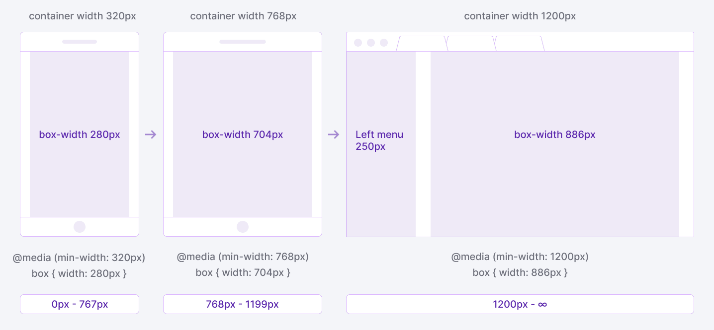
- The layout of the page depends on the breakpoint.
- Each range determines the number of columns, maximum content width and content wrapper margins.
- You can set your own breakpoints, if it's necessary for the correct display of the interface in a particular case.
Page layout and grid behavior
TIP
On 1200px left menu with width of 250px appears and "eats away" space of the product page.
| Breakpoint | Columns | Gutter | Max. content width | Content wrapper margins | Layout scheme | Description |
|---|---|---|---|---|---|---|
| min-width: 320px (320-767) | 4 | 24px | 500px for landing pages | margin: 16px 0px 80px for landing and product pages |  | Mobile & tablet devices. The content has a one-column structure. The left menu is hidden. |
| min-width: 768px (768-1199) | 6 | 24px | 720px | margin: 24px 24px 96px for landing pages, margin: 16px 24px 96px for product pages |  | Mobile & tablet devices. You can arrange the content as a two-column structure. The left menu is hidden. |
 | Mobile & tablet devices (landscape mode). The content is arranged as a two-column structure. The left menu is hidden. | |||||
 | Desktop devices. The content is arranged as a three-column structure. The left menu is hidden. | |||||
| min-width: 1200px (1200-∞) | 12 | 24px | 980px for landing pages, 1920px for product pages | margin: 24px 24px 96px for landing pages, margin: 16px 32px 96px for product pages | 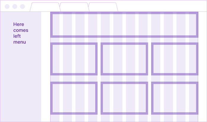 | Tablet & desktop devices. The left menu is open. Rearrange the content as a three-column structure. |
 | Tablet (landscape mode). The left menu is open. Rearrange the content as a two-column structure. |
Content max-width
Sizes in our grid system are based on the sizes of the left menu width (250px) and the maximum content width of our product pages.
The recommended maximum width of the content:
- for the product landing pages is 980px;
- for the product pages is 1920px.