Skeleton
Description
Skeleton is a component used to display the structure of a widget or page when it's initially loading. Its purpose is to provide users with a mental map of the data being loaded.
TIP
This component demonstrates the loading and response to user actions in the interface.
For general recommendations regarding such components, refer to the Loading patterns.
Use Skeleton for the following cases
- The content takes 0 to 5 seconds to load. If it takes longer, combine it with the ProgressBar.
- The number and approximate layout of elements are known in advance.
- When displaying dynamic information during initial loading: pages, widgets, complex components such as tables, charts, or selects.
Multiple skeletons can be shown simultaneously or asynchronously during the initial loading of elements.
TIP
It isn't recommended to use Skeleton for pages that are indexed by Google such as blog pages.
Themes
Skeleton has two themes—dark and invert–for using on light and dark/colored backgrounds, respectively. All skeleton “bones” have a border-radius of 4px.
| Theme | Appearance example | Styles |
|---|---|---|
| Dark |  | background: var(--skeleton-bg). |
| Invert |  | background: var(--skeleton-bg-invert). |
Animation
The Skeleton is animated with a content appearance animation lasting 300 ms with an ease-out effect (refer to Code examples). The Skeleton gradient animation has a default duration of 2000 ms. Animation is applied per data block (widgets, tables, charts) without the need for synchronization between elements.
TIP
If you don't need animation in the Skeleton, you can stop the animation using the duration="0" property.
What should be skeletonized
The information on the page can be divided into 2 categories:
- Static information (doesn't need Skeleton).
- Dynamic information (needs Skeleton).
Static information (doesn't need Skeleton)
- Text, data, and components that don't depend on user actions and product settings.
- Product name.
- Widget titles and tooltips.
- Table headers.
- Components for actions such as buttons, inputs, toggles, and pills.
These components don't require additional loading and can be displayed immediately.
Dynamic information (should be skeletonized)
This information requires additional requests and a long time to load. It varies depending on the user's actions and specific projects. In most cases, this group includes:
- Widgets
- Tables
- Charts
- Project statistics
- Selects
Components that should never be skeletonized
Additionally, the following components should never use Skeleton—they should be loaded by the time the user interacts with them:
- NoticeBubble.
- Dropdown (selects and dropdowns are loaded immediately. However, if the dropdown contains a table with data, you can use a skeleton for it).
- Tooltip.
- Modal.
- Spin.
Text skeleton
Paragraph
Replace any paragraph with a single type of Skeleton.
- We recommend showing no more than three "bones."
- The width of the "bones" should match the width of the paragraph, but not exceed 600px.
- The length of the last "bone" should be 3/4 of the previous two "bones."

Headers
Each header is replaced by a "bone" with a height equal to the header's line-height.
- The header is always replaced by a single line of the skeleton "bone," even if it spans two lines.
- The width of the "bones" is set to 150px, and it can be increased in rare cases if necessary.
| Heading level | Appearance example |
|---|---|
| h1 |  |
| h2-h3 |  |
| h4 |  |
| h5-h6 |  |
Image skeleton
Illustrations
The Skeleton for illustrations depends on their size:
- For small-sized illustrations like user pictures or advertising previews, show a skeleton "bone" corresponding to the illustration size, and immediately replace it with the actual illustration upon loading.
| Step | Appearance example |
|---|---|
| 1. Initial loading |  |
| 2. Replace by illustrations and text |  |
- For large-sized illustrations like screenshots on landings or blog pictures, consider using a multi-step loading process. Show small pictures and the Skeleton initially, replace them with text and user pictures, and then load the large image blurred before fully loading it.
| Step | Appearance example |
|---|---|
| 1. Initial loading |  |
| 2. Small illustrations and skeleton are replaced by text and user picture, the large one is loaded blurred |  |
| 3. Big illustrations is fully loaded |  |
Icons
In most cases, avoid using a Skeleton for icons. Either hide them or leave them in a disabled state. If needed, a skeleton "bone" for an icon should match the icon's size, and there should be a multiple of 4 margin between multiple icons.
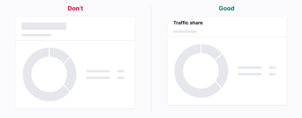
Chart skeleton
For charts, avoid showing axes and labels. Replace the legend with a Skeleton, and refer to Chart principles for more detailed guidelines.
Button and link skeletons
- If a button or link takes the user to another page, leave them as is during the initial loading of the page/widget.
- If a button or link submits data or confirms user actions, set them to a
disabledstate while loading.
TIP
When you don’t know what type of button (primary or secondary) should be loaded, show Skeleton instead of the button.
Skeleton in complex components
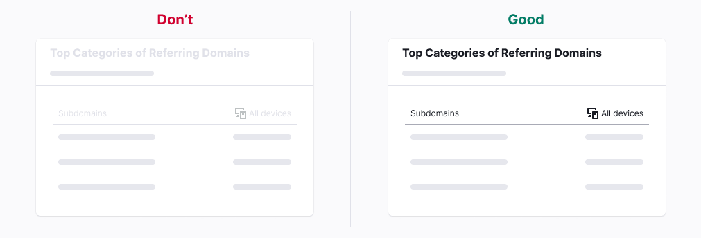
Table
Primary tables
- Replace text and links with Skeleton.
- Disable row controls during the initial loading of the table.
- Keep the table header and sorting active during the initial loading of the table.


Secondary tables
- Replace text and links with Skeleton.
- Keep the header active during the initial loading of the table.
- For widgets with a maximum of five text rows, show all of them.


Chart
- Keep pills active during the initial loading of the table.
- Replace the legend with skeleton "bones" of the same size. If the legend values are known in advance, show them during the initial loading.
- Replace the chart with the corresponding Skeleton based on the chart type. For more details, refer to Chart principles.
Summary
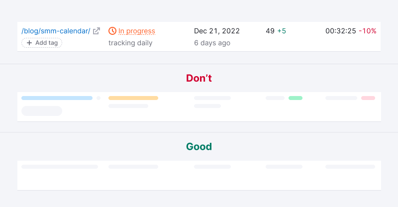
- Avoid showing trends, additional information, and links during initial loading.
- Keep
Infoicons active during initial loading. - Replace icons inside the Summary with Skeleton "bones" of the same size.
- Replace the values with Skeleton "bones" matching the size of the value's line-height.

Pills
Pills should never be disabled. They should always remain active, even during the initial loading, to let users navigate to their desired tabs.
Pills with counters
During the initial loading of the page, the counters in the pills can be displayed as skeletons. For more information about page loading, refer to Web-performance.

Big pills
Skeletonize big pills similarly to the Summary.
- Avoid showing trends, additional information, and links during initial loading.
- Replace the values with skeleton "bones" matching the size of the value's line-height.

Usage in UX/UI
Use Skeleton only for displaying dynamic information. Information that can be shown instantly and remains unchanged should be displayed immediately.
Static information should be shown immediately. It shouldn't be disabled.
Use Skeleton to display changing page titles—for example, the project name or widget title that depends on certain factors.
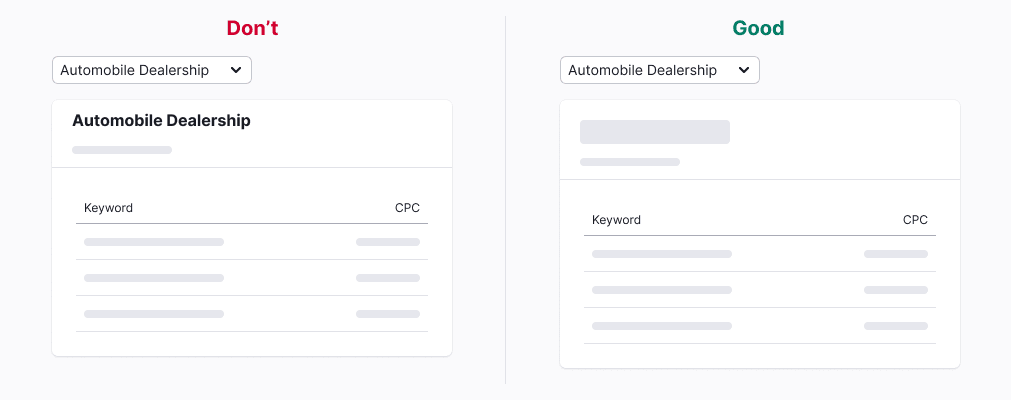
Show only the main information and avoid showing unnecessary additional details during the initial loading of the page.
Avoid displaying icons separately from the text or links they belong to. The exception is for icons that represent critical information.

Buttons and checkboxes need to be disabled during the initial loading of the table.

Show Info icons and tooltips so that users can read loading information during the initial loading.

Show dropdowns and selects immediately during initial loading.

Don’t add too many skeleton "bones." Add no more than three. Otherwise, you'll increase the page load time excessively.
