 Developer
 Description
DropdownMenu is a component for displaying the list of options and their nested items.
Sizes and indents
DropdownMenu has two sizes.
| Size | Appearance example and indents |
|---|---|
| M | 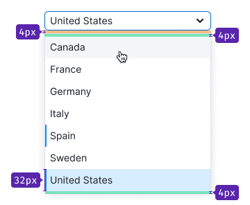 |
| L | 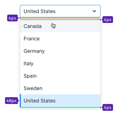 |
Width
The width of the dropdown can be defined several ways:
| Example | |
|---|---|
| The width of the dropdown can be defined by the maximum width of the trigger. |  |
| The width of the dropdown can be defined by the longest item in the list. | 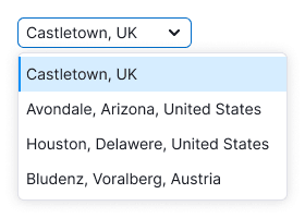 |
Height
It is recommended that the dropdown list with search should have a maximum height of seven items. If there are more items, the dropdown will have a scroll and a fader for the next item.
However, if you're using DropdownMenu for a list of links and controls, such as a menu, it is essential not to limit the dropdown's height. This is necessary to display all possible options to the user.
Placement
The list always drops down, regardless of space availability under the trigger. This behavior is necessary to enable accessible keyboard control of the list.
States
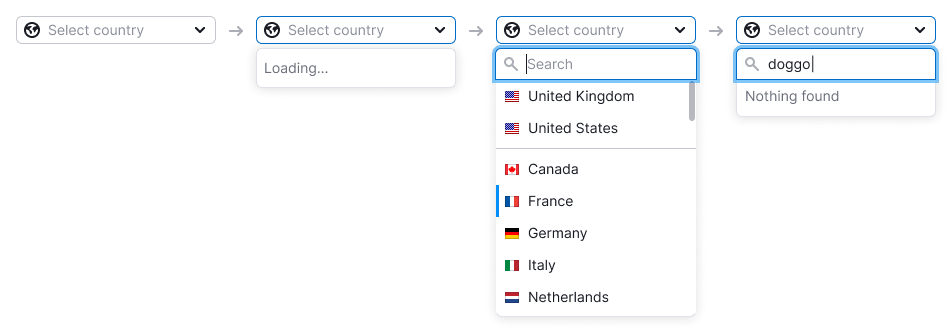
- If the list is taking a long time to load or filter results (for example, due to a slow connection), the dropdown should display "Loading...".
- If a user enters a value that isn’t in the list, the dropdown should display "Nothing found".
- If there are backend errors, a warning message should be displayed with the text "Something went wrong. Please try again later."

Data loading
If the list takes time to load, such as when the system cannot load it all at once or when searching for data elsewhere, change the Chevron icon to a spinner with XS size. In this case, the trigger isn’t clickable and remains in the default state.
For more information about trigger states, refer to Select / Multiselect.

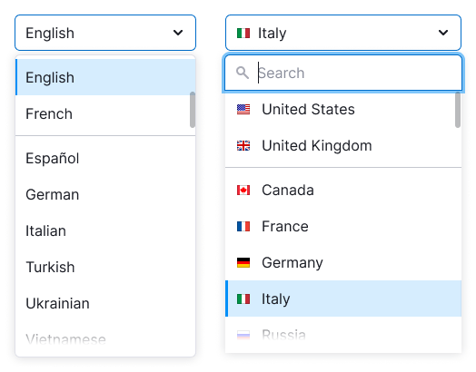
List with search input
If the list includes a search input, it should automatically receive focus when the user opens the dropdown.
As the user enters a value into the input, only the items that match the input should remain in the list. Don’t highlight these items in this case.
List item states
States
| Appearance | Tokens | |
|---|---|---|
| Default |  | --dropdown-menu-item |
| Hover |  | --dropdown-menu-item-hover |
| Selected |  | --dropdown-menu-item-selected |
| Selected with hover |  | --dropdown-menu-item-selected-hover |
| Disabled |  | --disabled-opacity |
List item types
Divider
The dropdown list can be separated by Divider.
Title
List item can be a title. It doesn't have hover or active state and it isn’t clickable. The title always has font-weight: var(--bold) and the same size as the list items have.
Button
You can add a button to any list.
Action button
Action button opens another dropdown, takes user to a new page or performs any other action on the page.
The item with button should have the same hover as a regular item in the list.

Addition button
This item with such a button adds a new item and has the following states:
| State | Appearance example | Description |
|---|---|---|
| Default trigger button |  | Trigger has the same styles as a regular item. |
| Active input |  | Clicking on the button opens an input in the focus state. The list item has no hover state in this case. |
| Entering value |  | To add an item, click the submit icon. To close the input, click outside the input or press the Esc key. If user entered data but closed the input without submitting, their entered value should be saved. |
| Loading |  | For loading state change submit icon to Spin with XS size. Input receives the disabled state. |
| Error |  | If an error occurred during adding, show the error message in a tooltip and highlight the input. |
Button inside the item
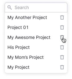
You can add an icon to the right of an item for an additional action.
| Case | Appearance example | Description |
|---|---|---|
| Delete item | 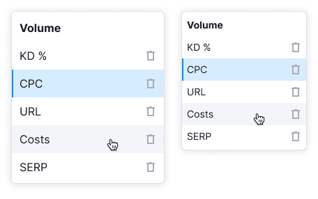 | If a list item can be deleted, use the Trash icon. |
| Drag and drop | 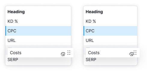 | To drag and drop list items, use the MoveAlt icon with the --icon-secondary-neutral color. The icon should appear when hovering over the item, and the cursor should change to move. For more information on dragging and dropping items, see the Drag and drop. |
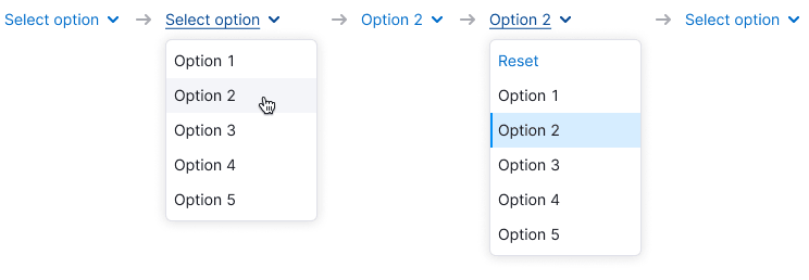
Reset button
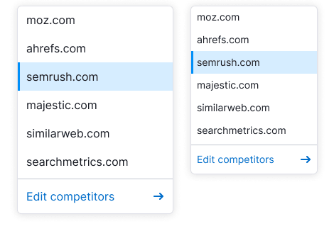
You can add reset button to the list to reset the selected value or values. Place it at the top of the list.
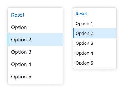
The reset button appears only if any item from the list is selected. After user clicks on the item, the button should hide and the trigger gets the the default value with placeholder.
List item content
You can put the following addons before and after the text inside the list item:
Addon before the text
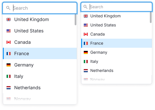
Before the text you can place an icon, flag or image. In this case icon always has the color of the text.
| Addon | Appearance example |
|---|---|
| Icon |  |
| Flag |  |
| Image/avatar |  |
Addon after the text
After the text you can place either non-interactive and interactive addons: an icon, badge, switch, link or button.
If an icon displays additional information about an item, we recommend placing it right next to the text.
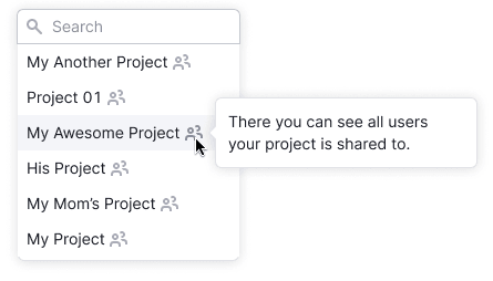
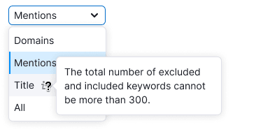
Info icon
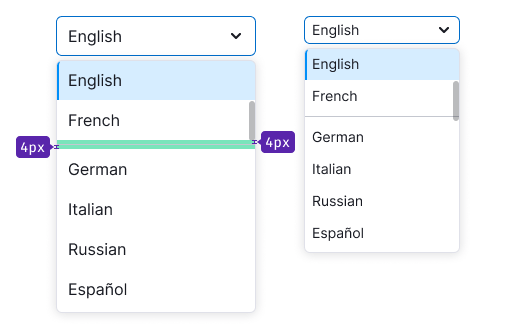
Info icon displays a tooltip when hovered over (see examples in the Informer). We recommend making the active zone for the icon larger than the icon's size. The margin between the icon and the text should always be 4px.

Counter
You can place a text counter after the text. It should have the same size that item's text has.

Badge
Badge can be placed after the text. The margin between the text and the badge is always 4px. If item with badge is selected, then don’t show badge in the trigger.

Secondary text
You can add additional text with --text-secondary color under the main text of the item.
| Size of the list | Appearance example | Tokens |
|---|---|---|
| M |  | --fs-200, --lh-200 |
| L |  | --fs-300, --lh-300 |
Scroll in the dropdown
If DropdownMenu has more than seven items, show scroll. We also recommend adding search input to such lists.
TIP
If you use a DropdownMenu for a menu, show all the items even if there are more than seven. It's important for the user to see all available options, especially if there are links or different controls. We don’t recommend using a scroll for such menus.
Fixed item
You can fix an item with a title, input, notice or a button on the top or at the bottom of the list. Such item should be separated by a Divider and fixed while scrolling the list.
| Item content | Appearance example | Description |
|---|---|---|
| Title | 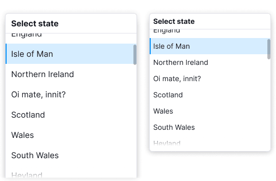 | Fixed title refers to the entire list and it should have a Divider. |
| Input with search | 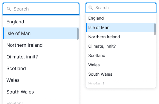 | If the list has more than 10 items, add the search input. When user opens the list, the input gets the focus state. For a placeholder use the text: “Start typing {parameter}” or "Search". |
| Notice | 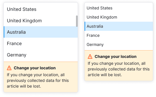  | The notice title should have the same size as the text has and font-weight: var(--bold). |
| Button | 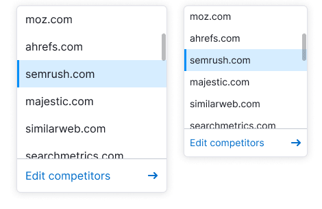 |
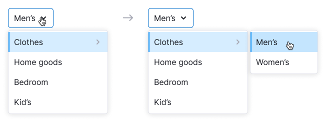
Nested dropdown menus
The menu item can have a nested menu. In this case, it should have the ChevronRight icon to indicate the nesting.
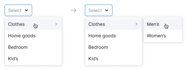
The maximum recommended nesting level is two, but it's better to avoid nesting altogether because large menus can be inconvenient to work with. If there's sufficient space, nested lists will drop to the right; otherwise, they will drop to the left.
Nested menus hide after the 0.3 seconds delay in the following cases:
- When user hovers over another item in the parent list.
- When mouse cursor moves away from the dropdown.
- When the entire dropdown closes (for example, by pressing the
Escbutton).
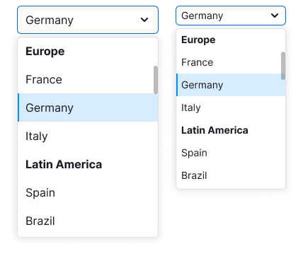
If user selects a nested item, only its name will be displayed in the trigger, without the name of the parent item.
Selected item in nested menu
If an item in a submenu is selected, the submenu stays hidden until the user opens it.
To prevent inconvenience for users with small screens, avoid expanding the entire chain of submenus when opening a dropdown with a selected item in such a menu.