INFO
Basic data visualization rules are described in the D3 chart.
Description
Area chart shows trends and the relationship between numeric variables over time. Area charts often used to show overall trends over time rather than specific values.
Key considerations for using area chart:
- Use an area chart to present a broader view of data. For example, line charts are good for tracking population changes over time, but area charts excel at showing the total population volume over a period.
- Stick to no more than four data sets to keep your chart readable. If you have more, the Line might be a better choice for a clearer view.
- Ensure the chart is clearly labeled for easy understanding of the axes.
- For showing data proportions as well as quantities, use a Stacked area chart.
TIP
Refer to materials below, to have insights on choosing between line and area charts:
Appearance
Charts are displayed with non-curved lines by default (without curve property) to make it easier to read exact values.
| Example | Styles |
|---|---|
 | Line thickness: 3px. The background color under the line matches the line color with 0.2 transparency. |
Display dots on lines when data points either are few or collected irregularly.
| Example | Styles |
|---|---|
 | Dot has size 8px * 8px and border: 1px solid var(--chart-grid-border). On hover, dot expand to 10px * 10px. |
Interaction
Hovering over the chart highlights the nearest point with a vertical guide line, enlarges the dot, and shows a detailed tooltip. The color of the vertical guide line is --chart-grid-y-accent-hover-line.
TIP
For detailed tooltip information, see Chart principles and Line chart.
Edge cases
One value
Display dots by default for charts with a single data point. The line is dashed and colored with --chart-palette-order-other-data.

Two values
Display dots by default.
Example 1 is for two distant dates.

Example 2 is for consecutive dates.

Null values
Display the line at the zero axis if all values are zero.
TIP
Zero counts as data. 0 ≠ n/a.

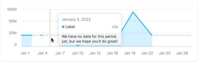
No data
For periods without data, use a dashed line between known points.
TIP
When there is no data, you can't draw a zero line. Zero counts as data. 0 ≠ n/a.
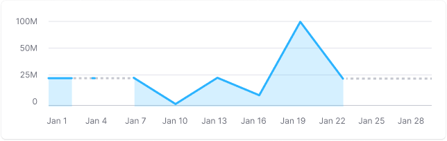
Display a tooltip with n/a when hovering over a dot without data, and explain why, if possible.
Initial data loading
Show Skeleton during initial loading. If the chart has a title, display it to inform users about what's loading. Refer to Skeleton for more details.
Use the --skeleton-bg color token for the skeleton's background.

Refer to Error & n/a widget states for all other empty states.