 Developer
 INFO
Basic data visualization rules are described in the D3 chart.
Description
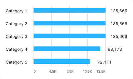
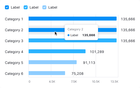
Horizontal bar chart visualizes distribution of values by category for value comparison.
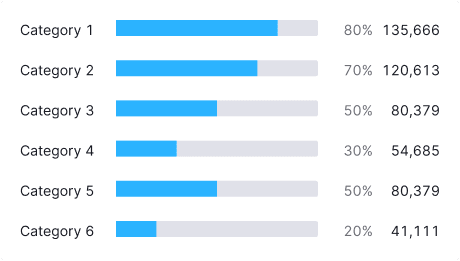
We have a compact version of the horizontal bar chart — Compact horizontal bar chart. Use it when values of all categories add up to 100%, and you need to save space in the interface, and the category names can be long (for example, in localization).

Usage
Use Horizontal bar chart when:
- Comparing less than 10 categories.
- Each category's value needs labeling.
- Showing category distribution in the specific order.
Avoid using Horizontal bar chart when:
- Displaying trends (use Line chart).
- Showing data over time (use Bar chart or Line chart).
- All categories add up to 100% (use Donut chart).
INFO
Bar vs. Histogram Chart
- Bar charts categorize data qualitatively, showing how different categories compare.
- Histograms organize data quantitatively, indicating how often values fall within certain ranges.
Appearance
For the grouped bars aim for at least a 20% margin between bars in the group to avoid clutter.
For more than 3-4 categories, consider using the Stacked horizontal bar chart or other chart type to present data. Additionally, consider allowing users to switch chart types in the widget settings.
Margins
Ensure clear margins for readability and to avoid clutter, such as 8px top and bottom and 16px between category labels and bars.
| Description | Appearance example |
|---|---|
margin: 8px 0px | 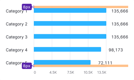 |
| The margin between categories and values on the Y-axis and bars is 16px. The margin between values is 8px. | 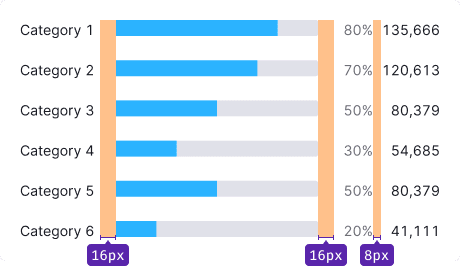 |
| The margin between categories shall be 20px minimum. Otherwise, the data becomes a mess. | 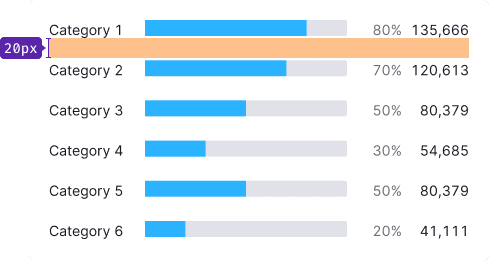 |
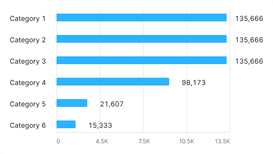
Grid and axes
No grid
Omit grid and axes when showing category values as a percentage of 100.
With grid
Use axes and grids for displaying distribution without percentage constraints.
TIP
Allocate space for category labels on both sides of the chart.
Category labels
- Y-axis labels use the primary text color (
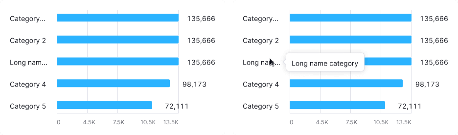
--text-primarytoken). - Use
ellipsisfor long labels, with tooltips showing the full name.
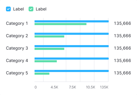
Legend
Legend is unnecessary for a single-category bar chart; clear chart naming is usually enough.
Use legends for multiple categories.
Interaction
Hovering highlights a bar with --chart-grid-bar-chart-hover, indicating focus or clickability. The hover takes up half of the bars margin on the top and bottom sides.
| Appearance example | |
|---|---|
| Chart with one category | 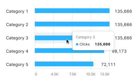 |
| Chart with two or more categories | 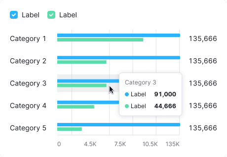 |
Edge cases
No more results
Show "No more results" with the --spacing-8x margin below values and text with --text-secondary color. Refer to Error & n/a widget states for all other empty states.

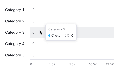
Null values
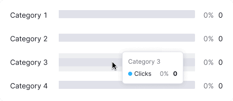
If all values on the chart are zero, display zero in the tooltips.
TIP
Zero counts as data. 0 ≠ n/a.
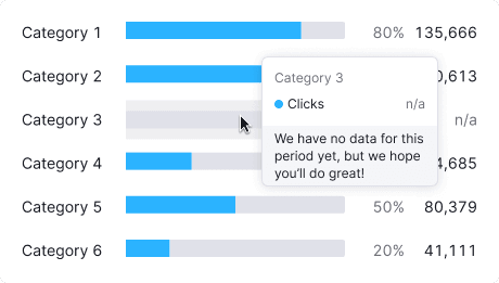
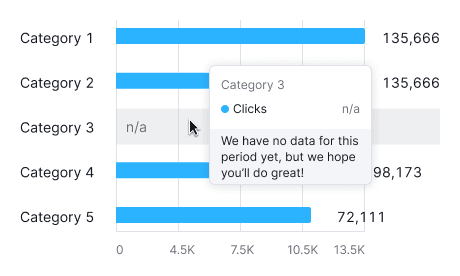
No data
Do not display value inside the bar for data points without values. When hovering over such bars, show a tooltip with the "n/a" value. Additionally, consider adding a message explaining the absence of data and providing information on when it will be available (if possible).
Initial data loading
Show Skeleton during initial loading. If the chart has a title, display it to inform users about what's loading. Refer to Skeleton for more details.
Use the --skeleton-bg color token for the skeleton's background.

Refer to Error & n/a widget states for all other empty states.
Usage in UX/UI
Key points for using Horizontal bar chart:
- Ensure the chart's axes are understandable. Label them if needed.
- Use simple color schemes. Highlight categories only when needed.
For the other detailed information, refer to the Bar chart guide.