FeaturePopover
Description
FeaturePopover is a component that helps drawing users’ attention to an interface part or control. For example, it may point to a new function or suggest the next step to the user.
FeaturePopover contains only basic reference/promotional information. The purpose of this component is to point to a specific feature and offer to use it.
Use it when:
- It's necessary to draw the user’s attention to an interface part.
- You need to point at the next step for the user.
Component composition

Component consists of the following:
FeaturePopover.TriggerFeaturePopover.SpotFeaturePopover.PoppercloseIconproperty (forFeaturePopover.Popper)FeaturePopover.StepCounter- Content
Appearance
Themes
This component has two themes:
theme | Appearance example | When to use |
|---|---|---|
accent | 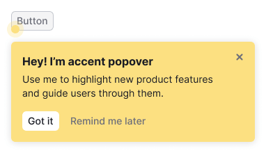 | Use this theme to highlight new features and for onboarding related to them in the product. |
neutral | 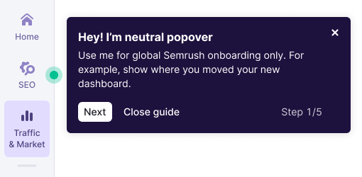 | Use this theme only for global Semrush onboarding. |
Spot
The animated spot is always located in the corner of the element you want to draw attention to.

Try to avoid situations where the control has both Dot and FeaturePopover.Spot.

Title
The title should be brief, contain a call to action, and summarize the main thought of the paragraph.

Feature description
The feature description should be short and informative. Try using no more than one or two sentences. A paragraph may contain links and formatted text.
Close button
The Close button is always placed in the upper-right corner of the FeaturePopover and is used to close it. We recommend always displaying this control and not hiding it from the user.
Buttons
Two buttons are always placed under the message.
- By clicking the "Got it" button FeaturePopover closes forever.
- By clicking the "Remind me later" button FeaturePopover closes until the next user session.
Step counter
You can enable the step counter to show the user how many messages they need to read. We recommend turning it on for walkthroughs when you need to guide the user through several features or changes in a row.
Illustration
You can add an illustration to your FeaturePopover to help the user to understand the basic idea of your message. It can also be animated if it makes it easier to understand the feature.
| Illustration size | Illustration example |
|---|---|
| Small, 40px * 40px | 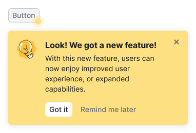 |
| Large, 80px * 80px |  |
Maximum width
You can use wMax property to set the maximum width of the FeaturePopover's popper. But we recommend to set the following widths:
- 350px for FeaturePopover without illustration.
- 400px for FeaturePopover with step counter.
- 550px for FeaturePopover with big illustration.
Content indents
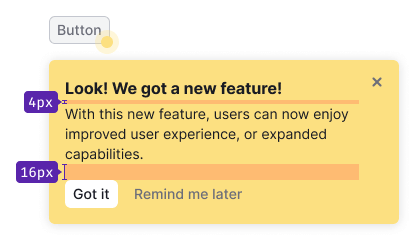
- For the title use 16px font-size (
--fs-300,--lh-300tokens). Margin-bottom is 4px (use--spacing-1xtoken). - For the paragraph use 14px font-size (
--fs-200,--lh-200tokens). - The invert
primary&tertiarymuted buttons have M size. Top margin for the group of controls is 16px (--spacing-4xtoken). - Illustration's margin-right is 16px (
--spacing-4xtoken).
Displaying and hiding
Component appears according to the timings you set through the timeout property.
FeaturePopover hides after using one of its buttons, pressing Esc, or using the highlighted interface element.
FeaturePopover as part of onboarding
Show onboarding only to new users who have never seen it. If the user has already seen onboarding once, don’t show it again to them.
Usage in UX/UI
General recommendations
- Use
FeaturePopoveronly to display promotional or onboarding information. The purpose of component is to emphasize a feature and/or explain why it can be useful to the user. - Mind the user path and the context in which users will encounter the
FeaturePopover. Show it ad hoc and don’t overload the message with unnecessary information. - Always allow the user to close the
FeaturePopover. Don’t force the user to use the advertised feature. - Write briefly and concisely. Information in
FeaturePopovershouldn't exceed the minimum required to start using the function. Move additional step-by-step instructions to an Informer, DescriptionTooltip, and so on. - Make sure that
FeaturePopoverdoesn't cover important parts in the interface that the user needs in the context of use.
Terms of use
- Don’t show more than one
FeaturePopoverat the same time. FeaturePopoverfor a new function should be shown for no more than a month.FeaturePopovershould be shown in context, for example, when the user interacts with elements in a certain part of the page, or when the next step in the flow should be the highlighted element. If the user interacts with filters, there is no need to showFeaturePopoveron the element in the table. Don’t distract the user.- Don’t show
FeaturePopoverif the user has already interacted with the advertised item. FeaturePopovershould be shown only once (except for cases when user clicked "Show later"). If the user has closedFeaturePopoveror clicked "Got it", don’t show this message to them again.
Recommendations for copy
Title
- Describe the main value of a feature for the user in the title. For example, "Save filters to get data" instead of "Saved filters", or "Work together" instead of "Collaboration".
- Write briefly. Always use a verb in the title.
- Avoid repeating the control label or the text of the element, to which FeaturePopover points.
- Also, avoid repeating the text of the paragraph.
Message
- Describe a feature or a tip with one or two sentences.
- Tell not only about the feature itself, but also about how to use it and how it can help the user.