Wizard
Description
Wizard is a component that guides users through a series of predefined steps to complete a larger task. It simplifies complex tasks by breaking them down into manageable steps, reducing the perceived complexity.
Usage recommendations
When to use wizard
- Use a wizard when dealing with large tasks that can't be simplified. Breaking them down into steps helps users focus on each part of the task.
- If a task requires a specific sequence of steps to be followed, a wizard ensures users don't miss important parts and make fewer mistakes.
- Wizards are suitable when a task involves three-five steps. For smaller tasks with just two steps or very large tasks with more than ten steps, consider alternative approaches and components.
When not to use wizard
- Avoid using wizards for educational purposes, as they focus on task completion rather than providing additional information for learning. Instead, use components like FeaturePopover, Informer, DesctiptionTooltip, or videos for education.
- Advanced users may find predefined steps in a wizard restrictive. Consider using wizards for audiences that would benefit from step-by-step guidance.
Component composition

Component consists of the following:
Wizard.SidebarWizard.StepperWizard.ContentWizard.StepWizard.StepBackWizard.StepNext
Appearance
Stepper states
| State | Appearance example | Styles |
|---|---|---|
| Normal |  | background-color: var(--control-primary-advertising), border-radius: var(--rounded-medium) |
| Hover |  | background-color: var(--control-primary-advertising-hover), cursor: pointer |
| Active |  | background-color: var(--control-primary-advertising-active) |
| Disabled |  | Use --disabled-opacity token. |
| Checked |  | The number changes to a Check icon with M size. |
Stepper styles
If a Stepper has optional text, it should have the following styles:
color: var(--intergalactic-text-secondary-invert);
margin-top: var(--intergalactic-spacing-1x);
Content area styles
Header margin

Footer margins
For basic controls use L size.

Keyboard control
- When opening a Wizard, the focus should move to it.
- Users can move between interactive elements within the window using the
Tabkey. - The Wizard can be closed with the
Esckey.
When the Wizard closes, the focus should return to the page. Refer to Accessibility guidelines.
Wizard in Modal
For the Wizard displayed in a Modal, ensure the following styles:
max-width: 980px;
max-height: 700px;

Collapsing panel with steps on screen less than 1060px
Collapse the panel to 44px, leaving only the step numbers. When hovering a step number, show the name of the step.


Placement
The scroll behavior inside and outside the window, the general rules for content, etc. are the same as for the Modal component.
Center the Wizard relative to the user's viewport. And leave margins of 40px outside the window.


Usage in UX/UI
TIP
For consistent user experience within products of the same platform, use a Wizard for setting up products.
In exceptional cases, steps can be placed in the content area of the page.
Here are some scenarios where a universal solution is recommended:
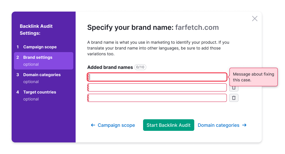
Form validation
After submitting a form, highlight all invalid inputs and focus on the first invalid input.
For more information about validation, refer to the Validation.
Form loading error
If an error occurs on the backend while submitting a form, display the error message above the form.

Sizes of form controls
In the form, use the same sizes for inputs and controls.

Saving entered value
If data entered into the form by the user wasn't sent and the window is closed, save the entered data so that the user doesn't lose it.