INFO
Basic data visualization rules are described in the D3 chart.
Description
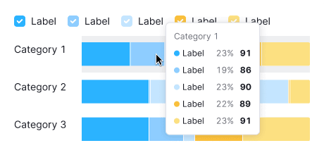
Horizontal stacked bar chart is used to display multiple categories of values and illustrate their proportions relative to the total.
Key points for using horizontal stacked bar chart:
- Choose this chart to compare more than two categories.
- It's ideal for showing how parts contribute to a whole.
- Pick distinctly different colors for clarity. Avoid using too many colors for categories. Shades of one color can work well.
- Ensure the chart is large enough to easily read the data.
TIP
Bar vs. Histogram Chart
- Bar charts categorize data qualitatively, showing how different categories compare.
- Histograms organize data quantitatively, indicating how often values fall within certain ranges.
Usage
Refer to the Horizontal bar chart.
Appearance
Choose contrasting colors for different categories.

Margins
Refer to the Horizontal bar chart.
Grid and axes
Refer to the Horizontal bar chart.
Category labels
Refer to the Horizontal bar chart.
Legend
Refer to the Horizontal bar chart.
Interaction
Hovering highlights a bar with --chart-grid-bar-chart-hover, indicating focus or clickability. The hover takes up half of the bars margin on the top and bottom sides.
Edge cases
Refer to Horizontal bar chart.
Initial data loading
Refer to the Horizontal bar chart.