INFO
Basic data visualization rules are described in the D3 chart.
Description
Stacked bar chart is used to display multiple categories of values and illustrate their proportions relative to the total.
Key points for using stacked bar chart:
- Choose this chart to compare more than two categories.
- It's ideal for showing how parts contribute to a whole.
- Pick distinctly different colors for clarity.
- Ensure the chart is large enough to easily read the data.
TIP
Bar vs. Histogram Chart
- Bar charts categorize data qualitatively, showing how different categories compare.
- Histograms organize data quantitatively, indicating how often values fall within certain ranges.
Appearance
In a stacked bar chart, bars have no gaps between value segments. Select contrasting colors for visibility.
Aim for at least a 20% margin between bars to avoid clutter.
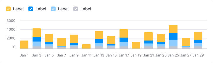
Chart colors
Stick to the designated chart palette and ensure consistent color use.
Interaction
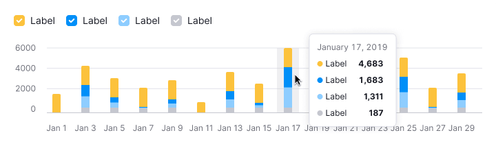
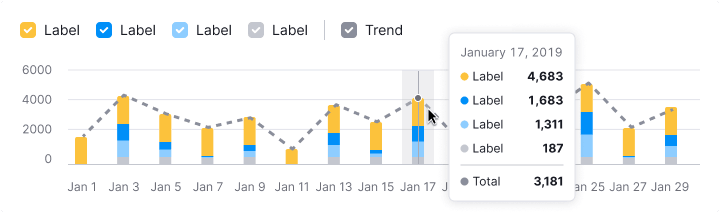
Hovering highlights a bar with --chart-grid-bar-chart-hover, indicating focus or clickability. For trend lines, display corresponding points on hover.
For more, refer to the Bar chart.
Trend
Trend lines can help identify overall patterns but may clutter simple charts. If used, ensure tooltips provide comprehensive value details.
Edge cases
Edge cases for stacked bar chart align with those of the Bar chart.
Initial data loading
For loading details, refer to the Bar chart guide.
Usage in UX/UI
Refer to the Bar chart guide, for the detailed information on specific use cases.