Description
DataTable is a complex component designed for managing complex data lists.
Appearance
Types
Our design system offers two table types – primary and secondary.
Common styles for table content
| Content | Styles and tokens |
|---|---|
| Text in the header | Use --fs-100 and --lh-100 tokens for font-size and line-height respectively, and --text-primary token for color. |
| The text in the row | Use --fs-200 and --lh-200 tokens for font-size and line-height respectively, and --text-primary token for color. |
| Secondary text | Use --text-secondary token for color. |
| Stand alone icon | Icon with M size and --icon-secondary-neutral token for color. |
| The icon next to the text | Icon with M size and --icon-secondary-neutral token for color. |
| Header and cell checkbox | Use Checkbox with M size. |
Sorting
For detailed information on sorting columns in the table, refer to Table controls.
Tooltip
To display additional information about a column, use tooltip. It will appear by hovering over the column title.
Conditions for the tooltip appearance
| Appearance example | |
|---|---|
If text is too long and collapsed into an ellipsis. | |
| If the column has additional explanatory information. |
Table row states
TIP
Hover state for a row is required for all table types.
Hovering highlights information in large data volumes, making it easier to perform actions such as reading, deleting, or opening.
- The row changes to the
hoverstate when you hover over any part of it. - If the cursor is over an item, the row remains in the
hoverstate, and the item under the cursor is also highlighted.

Hover styles for different cells
If an entire row is in the disabled state, it should not have a hover state.
TIP
Consider using darker icon colors to increase contrast when using colored cell backgrounds. For instance, switch from --icon-secondary-neutral to --icon-primary-neutral.
| State | Appearance | Styles |
|---|---|---|
| Default, hover |  | background-color: var(--table-td-cell); border-bottom: 1px solid var(--border-secondary). When you hover on, background color changes to background: var(--table-td-cell-hover). |
| Unread, unread hover | 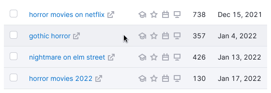 | background-color: var(--table-td-cell-unread). The hover state is the same as default cell has. |
| Selected, selected hover | background-color: var(--table-td-cell-selected). When you hover on, the background color changes to background-color: var(--table-td-cell-selected-hover). | |
| New, new hover | background-color: var(--table-td-cell-new). When you hover on, the background color changes to background-color: background-color: var(--table-td-cell-new-hover). | |
| Error, error hover | background-color: var(--table-td-cell-critical). When you hover on, the background color changes to background-color: var(--table-td-cell-critical-hover). | |
| Warning, warning hover | background-color: var(--table-td-cell-warning). When you hover on, the background color changes to background-color: var(--table-td-cell-warning-hover). | |
| Current, current hover |  | The row is tagged with tag You. The hover state is the same as the default state. |
| Loading | Change opacity of the elements inside a row to --disabled-opacity. Spin has size XS. | |
| Limit, limit hover | 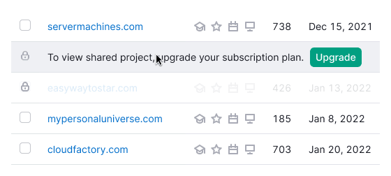 | For limiting rows use --overlay-limitation-secondary token. The hover state is the same as the default state has. |
Hover for row-span and col-span
- Hovering over the parent column highlights all child rows.
- Hovering over a child row highlights the parent column.
Cells coloring
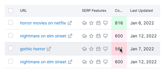
If a cell is colored, it remains colored when you hover over it. Users should not lose information about the cell's color when hovering over a row.
Content alignment inside cell
Text inside cells in rows and headers is aligned according to these rules.
Left-aligned
- Text
- The link (URL)
- Keyword
- Code/Numbers/Hashes (text consisting of numbers, symbols, and letters)
- Abbreviation
- Date
- Control element
- Button
- Select
- Tag/Badge
- Icons (if multiple, SERP features)
Center-aligned
- Numbers (if horizontal comparison is needed)
- Icon (if single)
- Particular character
- Image
Right-aligned
- Numbers (if vertical comparison is needed)
- Decimal numbers
- Tags/Badges (when marking the entire row)
Scroll bar
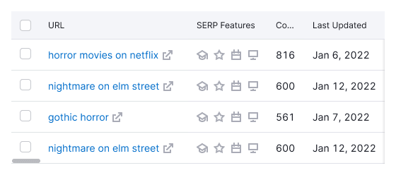
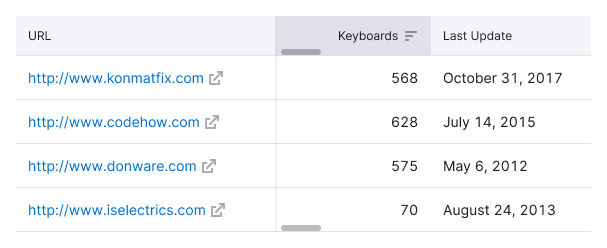
The most common case is scroll bar showed at the bottom of the table. Horizontal scrolling in our tables indicates hidden data beyond the viewport in wide tables. It is needed when:
- All table columns do not fit the viewport.
- Adding a new column from the settings manager makes the table data exceed the viewport.
- The screen where the user views the report is smaller than 992px.
TIP
Having a horizontal scroll in a large table is not a bad practice; it is a familiar experience for most users (similar to Excel). It is wrong when adding columns to a table makes them unnecessarily narrow, without the need for scrolling.
Two scroll bars
You can show two scroll bars in the table if necessary, adding scroll bar to the header and to the bottom of the table. It is needed exclusively for cases when the table is very long (or potentially long) and it has fixed columns so that the user can scroll more conveniently without scrolling to the very end. In such cases, the scroll bar can be either in the header and at the bottom of the table. Refer to the examples in the Fixed header section.
Pagination
Refer to the Table controls guide for detailed recommendations on pagination.
Table states
For information about table states, refer to the specific document on Table states.