FullscreenModal
Description
Fullscreen modal is a modal dialog that opens on top of the webpage. It blocks all functions of the parent page and has its own separate URL.
Use fullscreen modal component when:
- You need to focus user fully on a task that involves filling in, editing, or analyzing a large amount of information.
- You need to display a substantial amount of additional data for a report and require user input on what to do with that data.
- You need to show additional data for a report, but you don’t want to move it to a separate page.
- The screen size is smaller than 768px.
Appearance
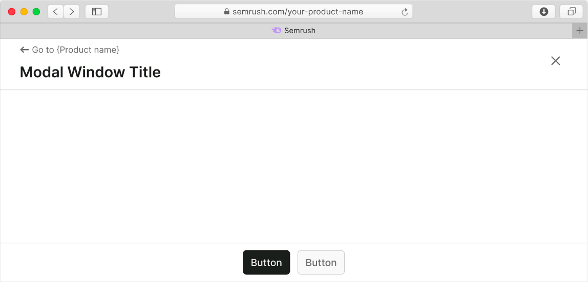
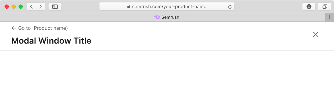
The fullscreen modal dialog includes:
- Fixed header with a title and buttons for going back to the product page and closing the modal.
- Content area.
- Fixed footer with submit and other optional controls.
Content styles
- Use 20px (
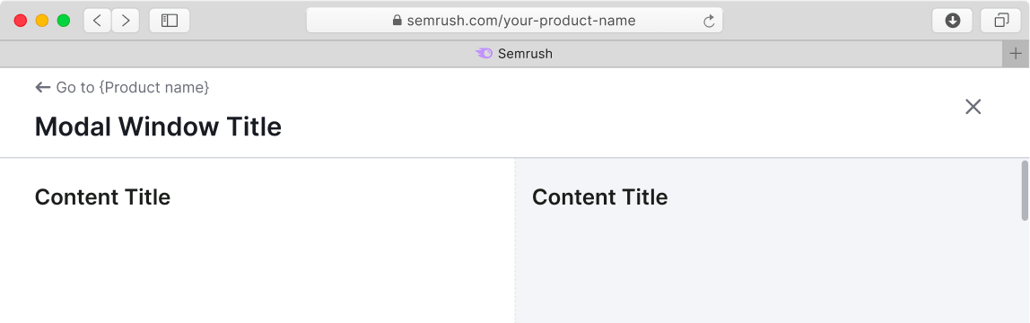
--fs-500) or smaller text sizes for headings in the content area to ensure correct hierarchy with the modal header. - You can divide content area into several areas. To visually separate them, use
--bg-secondary-neutraltoken as a background color for one of them.
| Single-zone modal window | Dual-zone modal window |
|---|---|
 |  |
Content alignment
- If there are two columns / zones for content in the modal window, the content inside them should be placed with
align: left. - If there is only one zone for content in the modal window, it's necessary to center the content with
align: centerhorizontally. We also recommend you to use the default Modal component in this case instead.
| Single-zone modal window | Dual-zone modal window |
|---|---|
 |  |
CTA buttons
You can use either size M or size L buttons, depending on your case.
TIP
The example below shows the default composition of the content, but depending on your case buttons can have different alignment.

Interaction
Fullscreen modal window can be closed:
- Using the Close button in the header
- Using the CTA or the Cancel button
- By pressing the
Esckey - With the browser's Back button (nothing changes on the parent page in this case).
TIP
When the fullscreen modal window is closed, focus always returns to its trigger.
States
Loading
When loading and reloading the content of the window, use SpinContainer with XXL size.
Error
If an error occurred during data loading, show an error message with the Reload button.
For error messages use Widget empty state component.