 Developer
 Description
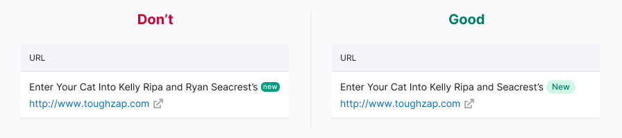
Badge is a visual component used to indicate the status of a feature or product.
For example, you added a new tab to the report. In this case, you can highlight a new feature in your product with a new badge.
Main features of the component:
- Badge cannot be deleted or added by a user. Badge is added to the elements by the system according to the rules described below in the table.
- Badge isn’t clickable.
- Don’t use badge for filtering the data.
Appearance
Component has one size.
Badge types
Use the following badges in the products depending on the status of the feature or product:
| Badge | Background | When used |
|---|---|---|
 | --blue-400 | Use it with features that are only available for users with admin rights. The functionality with admin badge isn’t visible to the other users. |
 | --red-400 | Use it with features which are available only to admins and a limited number of users who have been granted access as alpha users. The functionality under this badge should be used without any guarantees, it is unstable, and may be changed significantly over time or be disabled. |
 | --orange-400 | Use only for unstable functionality of a feature or product. A product/feature with this badge was released to test the product hypothesis, and it can have major changes in the future. |
 | --green-400 | Use with products and features that are out of beta, and with new features that are available to all users. Use it to attract attention to a new product or feature. |
 | --gray-400 | It can be set on “placeholders” for collecting feedback. |
Usage on dark/colored background
Every badge can be inverted like this:

Use --gray-white color for the background and --text-primary for the text color.
Feature status
The feature status can be shown inside most of the components and controls.
Button


Pill

Feature status in the notification

Badge vs. Tag
Don’t confuse Tag and Badge components. Tag is used for thematic grouping and labeling data, while the Badge indicates the status of a feature or product.
Location
Badge is usually placed to the right of the element. As an exception, in the Notice component, badge is positioned to the left relative to the text. Badge's margins are always multiples of 4.
Usage in UX/UI
| Component/block | Appearance example |
|---|---|
| Product header |  |
| Landing page header | 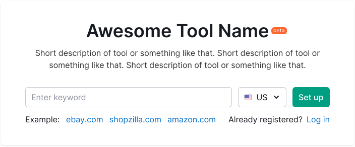 |
| Widget | 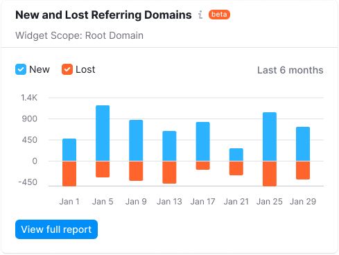 |