Tooltip
New component 🎉
Hint is now separate from Tooltip. You can find its documentation in Utils/Hint.
Description
Tooltip is a component used to display additional information about features and data.
Differences between Tooltip, Hint, DescriptionTooltip (Informer pattern), and Dropdown:
| Tooltip | Hint | DescriptionTooltip | Dropdown | |
|---|---|---|---|---|
| Contains | Element's additional description 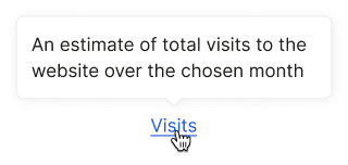 | Element's name, if hidden or cropped  | Extra information about features or data  | Forms, settings 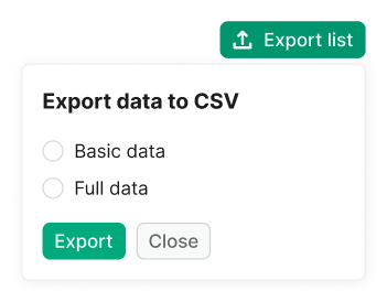 |
| Can contain interactive elements | ❌ No | ❌ No | ✅ Yes | ✅ Yes |
| Trigger is the same element the tooltip describes | ✅ Yes | ✅ Yes | ❌ No | — |
| Appears on | Hover/focus | Hover/focus | Click/Enter | Click/Enter |
| Has an arrow | ✅ Yes | ❌ No | ✅ Yes | ❌ No |
Read more about the differences between Tooltip and DescriptionTooltip in Interaction and Content.
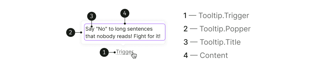
Component composition
It's useful to keep in mind that in code tooltips consist of two main parts:
- Trigger — the element that should be hovered, clicked on, etc, to show the tooltip,
- Popper — the tooltip itself, that is, the container for tooltip content.
Themes
Tooltip has three themes: default, invert for use on a dark background, and warning for validation messages. In all cases, the text color changes to --text-primary-invert, and the background color changes accordingly.
| Theme | Appearance example | Styles |
|---|---|---|
default |  | background-color: var(--tooltip-default), border: 1px solid var(--border-secondary), box-shadow: var(--box-shadow-popper) |
invert | 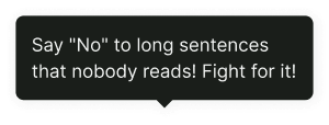 | background-color: var(--tooltip-invert), border: 1px solid var(--border-tooltip-invert), box-shadow: var(--box-shadow-popper) |
warning | 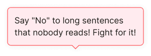 | background-color: var(--tooltip-warning), border: 1px solid var(--border-danger-active), box-shadow: var(--box-shadow-popper) |
Appearance
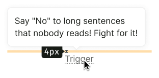
Maximum width and offset
By default, the Tooltip has a maximum width of 228px, but you can set a different width if needed.
Offset and arrow placement
The distance between the trigger and the tooltip is 4px.
The placement of the arrow depends on the placement property, refer to the live examples in the Placement section.
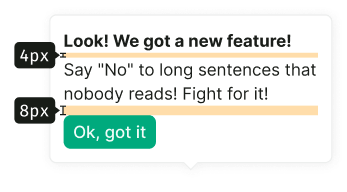
Paddings and margins
The content area of the tooltip has a default padding of 12px.

Content margins and paddings
TIP
It's recommended to use a font size of 14px (--fs-200, --lh-200 tokens) for the title in non-advertising messages.
The image inside the tooltip has a size of 130px * 130px.

Data margins
To improve readability, it's recommended to use specific margins between labels and values inside the tooltip. Detailed recommendations for tooltip margins can be found in Data visualization and Summary.

Placement
The tooltip is built using the Popper.js library, allowing you to change its placement according to the Popper API.
The default tooltip placement is top.
import { Box } from '@semcore/ui/base-components';
import type { Placement } from '@semcore/ui/base-components';
import Button from '@semcore/ui/button';
import Tooltip from '@semcore/ui/tooltip';
import React from 'react';

const styleBox = {
  display: 'grid',
  gridTemplateRows: '1fr 1fr 1fr',
  gridTemplateColumns: '1fr 1fr 1fr',
  gridGap: '2vw',
  padding: '60px',
};

const Demo = () => {
  const placements: Placement[] = [
    'top-start',
    'top',
    'top-end',
    'left-start',
    'right-start',
    'left',
    'right',
    'left-end',
    'right-end',
    'bottom-start',
    'bottom',
    'bottom-end',
  ];
  return (
    <Box style={styleBox}>
      {placements.map((placement, i) => {
        return (
          <React.Fragment key={i}>
            {['right', 'right-start', 'right-end'].includes(placement) && <div />}
            <Tooltip placement={placement}>
              <Tooltip.Trigger tag={Button}>{placement.toLocaleUpperCase()}</Tooltip.Trigger>
              <Tooltip.Popper>Hi there!</Tooltip.Popper>
            </Tooltip>
          </React.Fragment>
        );
      })}
    </Box>
  );
};

export default Demo;
Interaction
Tooltip is usually triggered by an interactive element, such as a table header, a Button, or a Link. Avoid using tooltips with non-interactive triggers like plain text and disabled controls: this makes tooltips inaccessible for keyboard and screen reader users.
DescriptionTooltip should have a separate trigger, such as a ButtonLink with an Info icon or a ButtonLink with "Learn more" text.
Appearance and hiding
Tooltip appears on hover and hides when cursor leaves both the trigger and the popper. If the trigger is focusable, it also appear on focus and hide on unfocus or Esc. 
DescriptionTooltip appears on click or Space/Enter, and hides when user clicks or moves focus outside of both trigger and popper, or presses Esc.
Delay of appearance and hiding
Default values for tooltip appearance and hiding:
- Appearance:
100ms - Hiding:
50ms
If the tooltip has interactive elements inside, the hiding time should be increased to 100ms.
Content
Tooltip content is closely related to its behavior, so you should choose the appropriate component depending on what you intend to show inside the tooltip.
| Component | Function | Content |
|---|---|---|
Tooltip | Show additional information about an element with a visible label | Short unformatted text, preferably no more than one sentence. |
DescriptionTooltip | Show information that's related not to the trigger itself, but to another element or the feature in general (Informer pattern) | Any amount of text, formatted or unformatted. Can include images, links, buttons and other element. |
TIP
For complex content and forms, use Dropdown.
Usage in UX/UI
Main recommendations:
- Use the tooltip to show hints and additional information only. Avoid adding complex functionality inside it.
- Ensure that the tooltip doesn't overlap important information for the user.
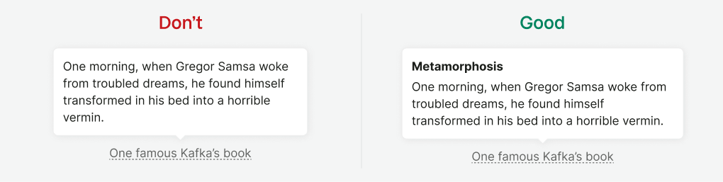
Avoid duplicating the trigger text in the tooltip title. The title may not be necessary if the trigger text already explains the tooltip content.

When the trigger isn’t clear enough, add a clear title to the tooltip. Additionally, include a title when the trigger doesn't adequately explain the topic of the tooltip. For example, you can describe additional conditions in the header or expand on the trigger's idea.

Divide long text into paragraphs.

Avoid overloading the tooltip with information. A large amount of content can be inconvenient to view in the tooltip. If there is too much content and nothing can be removed, consider using a separate paragraph on the page or widget instead of a tooltip.

Ensure that the tooltip doesn't prevent users from interacting with nearby triggers.
