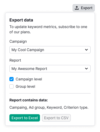
Description
Divider is a component that visually and semantically separates content or components.
Types
Divider has two types: primary and secondary. Secondary type helps to separate and show the connection between two parts of the content.
| Type | Appearance | Styles |
|---|---|---|
primary | border: 1px solid var(--border-primary) | |
secondary | border: 1px dashed var(--border-primary) |
Orientation
| Orientation | Example |
|---|---|
| Horizontal |  |
| Vertical |
Themes
The divider can be used either on a light or dark/colored background.
| Theme | Appearance | Styles |
|---|---|---|
| Default |  | border: 1px solid var(--border-primary) |
| Invert |  | border: 1px solid var(--border-primary-invert) |
Usage in UX/UI
The divider separates content visually and semantically, whether it is different or similar in meaning.
| Case | Example |
|---|---|
| Contact information needs to be visually separated from the form. |  |
| Separate information about a report's data visually from the form, but maintain its connection to the form. |  |