Accessibility
Color and contrast
Use of color
To ensure everyone can understand and differentiate visual elements, avoid relying solely on color. Different people see colors in different ways, and some may even be colorblind.
To use color thoughtfully, consider adding another indicator such as a visible border, label, underline, or icon. If you use charts and graphics that rely heavily on color, add other visual differences like hatching patterns or labels. It's also helpful to learn about color blindness and use a Figma plugin or browser extension to verify the accessibility of your designs.
Refer to WCAG color use guidelines for more information.
Text color contrast
Making text highly-contrasted against the background helps people read and interact with your interface more easily.
Based on current criteria, the contrast ratio should meet these minimums:
- Text smaller than 24px or 19px bold should have a contrast ratio of at least 4.5:1.
- Text larger than 24px or 19px bold should have a contrast ratio of at least 3:1.
Refer to WCAG text contrast guidelines for more information.
Non-text color contrast
All graphics and components must have a contrast ratio of at least 3:1 compared to the surrounding colors, unless they're purely decorative. This rule applies to icons, charts, infographics, controls, and any states like hover or active. However, inactive components, states, and purely decorative elements are exempt from these contrast ratio requirements.
Refer to WCAG non-text contrast guidelines for more information.
Typography
Refer to the Typography guide for the detailed recommendations.
Focus visible
Ensuring that users can easily identify which element has the keyboard focus is essential for keyboard users to navigate a page. To achieve this:
- Make sure the focus state is distinct from the mouse hover state, so the user can see the difference.
- Use a strong, visible focus indicator for interactive elements, such as links, buttons, and form fields.
- Ensure the focus indicator has a 3:1 color contrast ratio against the background.
Refer to WCAG focus visibility guidelines for more information.
Layout and structure
Make sure that user can easily understand the meaning and structure of the page and complete the required task. The design should help the user find key information quickly and easily.
TIP
Why it's important
- It allows users to quickly find the necessary information and solve their cases.
- It helps users quickly understand what's happening on the page.
Requirements:
- All content and design of the page should have meaningful sequence and fit into the logical structure.
- Make sure that users can navigate the site in multiple ways: with a table of contents, a sitemap, links between pages, and search on the website.
- Screen readers should read the information in the same order it's displayed.
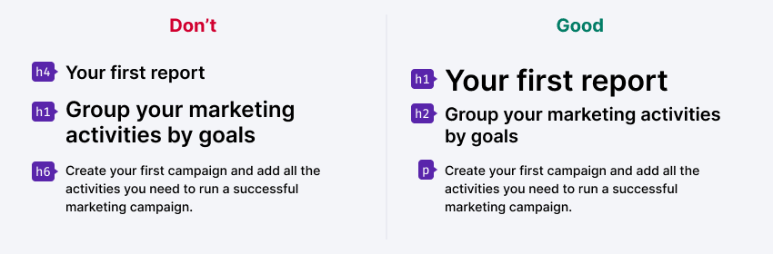
- Use styles correctly. Level 1 headings in the layout must be H1 headings in code. At the same time, text that's clearly not a level 1 heading shouldn't be marked up as H1 in the code. Also, don't use plain text for headings.
Refer to WCAG meaningful sequence guidelines for more information.
Scaling and resizing
Make sure that when you zoom in to 200%, the page is still readable and functional, and the user doesn't need to scroll horizontally to see everything.
People should be also able to increase the size of text to up to 200%. This helps those with partial sight to read your content comfortably. Although this change is implemented in code, it's important to keep it in mind when designing page layouts. Check that the text can flow at a larger size and isn’t limited by a fixed-width or fixed-height layout.
TIP
Why it's important. It's important for people with poor eyesight and when browsing the site on a mobile device.
Use adaptive layout to allow the user to choose their preferred scale while preserving the readability of the site. This is especially important for elements that contain small and low-contrast text.
This way you will both cover the needs of the visually impaired and ensure that your site can adapt for devices with any screen size. When the layout is ready, test the scaling by zooming in to 200% using Control+ (or Command+ on Mac).
Refer to WCAG text resizing guidelines for more information.
Graphics and images
Make sure that user understands all content, including charts, icons, and images.
Graphics
- Don't use graphics if your case can be solved with text.
- Make sure all graphics are accompanied by a clear text description. However, decorative graphics don't require a text alternative.
- Use icons as additional visual cues, not decorations, and only where it's really necessary. Choose easily recognizable icons (for example, a trash can for deleting something).
- Don't forget about contrast when placing text on an image. Use a solid background or make the image darker.
Data visualization
- Provide a text description for the data visualizations.
- Make sure data and specifications are clearly labeled.
- Provide sufficient contrast between the presented data (for example, lines in charts), so that colorblind users can distinguish between them. Getting a 3:1 contrast ratio between all colors in a data visualization can be hard. We recommend including other visual cues such as a difference in pattern and/or the use of textual labels (we plan to implement some solutions in our charts library).
Alternate versions
- Create an alternate form for the content that can't be presented as text. For example, to help the user find an ATM, you could offer a map, a table, or a list.
- Captcha tops the list of the most difficult and common problems that blind users face. It's often used needlessly from a security point of view, and can be replaced with other validation methods. If using a Captcha is absolutely necessary, be sure to add an audio alternative for visually impaired users.
To learn more, visit the text alternatives section of the WCAG website.
Media content
Make sure that your media content (videos, images, etc.) is accessible to hearing and visually impaired users.
Requirements:
- Add subtitles and a transcript to your audio and video content to make it accessible to the hard-of-hearing and the users who don't speak the language the content is presented in.
- Avoid harmful design elements. Make sure that you don't have elements that flash more than three times per second.
TIP
Animated website elements, flickering or flashing logos or ads can cause a seizure in people suffering from photosensitive epilepsy.
Forms

Provide instructions and hints to help users avoid mistakes when filling out a form.
- Make sure that all input elements have meaningful labels that remain visible even after a field has been filled out.
- Let the user know the data format in advance (date, phone number, zip code, etc.). It's also a good practice letting the user know when their Caps Lock button is enabled.
- Provide clear instructions to help user fix any errors.
TIP
Minimize the need to enter text or search. Whenever possible, enable voice input, text field autocomplete, and previews.
Useful resources
Web content accessibility guidelines on:
Labels and instructions
Make sure that the labels for the elements clearly indicate what will happen when the user clicks on them.
Requirements:
- It should be clear from the link text what will happen on click. Don't use URLs or the "Click here" anchor text for your links, as they're too uninformative. For example, instead of "Click here" use "Download report", or "Create account" instead of "Finish". This way, the user will have a clear idea of what will happen next.
- Links should be an organic part of a sentence. For example, it's better to write: "In the new version of the iPhone application, we added support for the Cyrillic alphabet" – instead of "In the new application for the iPhone, we added support for the Cyrillic alphabet. Download". Sentences like this are easier to understand for all users, and especially for those who use screen readers.
- If clicking on a link leads to the download of a document, let the user know. If your link leads to a PDF file, write: "Download instructions in PDF". This is important for mobile users with data caps.

Make sure that the instructions can be followed by hearing or visually impaired users.
Don't make references to the shape, size, visual layout, or sound. Prompts like "See image above" or "Find instructions in the right column" will mean nothing to a blind user, while a deaf user won't be able to follow the instructions like "Continue after the beep" or "Confirm the transfer via a phone call".

Useful resources
Web content accessibility guidelines on:
Touch targets
Make sure that the touch targets of the items are large enough and are easily accessible.
Requirements:
- Make sure that it's possible to reach the main controls with your mouse on the desktop device or with your thumb on the mobile device.
- Set target areas to at least 44px. An average adult's fingertip size is around 10mm, so you'll need to increase the size of the target area around your icons to make them easier to hit.
- Separate actionable elements with an appropriate margin. This will help the user activate the element they're aiming for.

Useful resources
Web content accessibility guidelines on:
Text readability
Why it's important
Some of your users may suffer from dyslexia or developmental disorders, making it difficult for them to read and understand complex sentences with rich or wordy expressions. Some of your users might not understand technical terms or slang. Mobile users also have difficulty reading long paragraphs of text.
Requirements:
Use clear headings. Make your headings clear and descriptive so that readers can easily understand what the following text is about. Try to keep your paragraphs short for easier viewing on mobile devices. Use short sentences whenever possible.
Be careful with typos. Watch your keyboard layout. Remember that the English letter C and the Russian letter С are 2 completely different characters, despite the fact that they look the same. Screen readers read symbols based on their code in the symbol table, and not from its typeface. So if there are any typos like this in the text of the page, it makes it extremely difficult to work with for your blind or visually impaired users.
Avoid idioms. Try not to use idioms or other expressions whose meaning can't be easily recognized from the usual meanings of the words that they consist of. For example, an expression like play the fool can be taken literally by users with mental disabilities or those who use a sign language to communicate.
TIP
To learn more, visit the Readable section of the WCAG website.