 Developer
 Design tokens
What is design token?
Basically, design tokens are atoms of the design system's visual styles. Think of them as values stored as predefined styles for predefined purposes, elements, and components.

TIP
For the Semrush developers and designers we have a couple of onboarding files. Refer to the following links:
- Themization workshop file which you can duplicate and play with the examples
- Brief tokens explanation from our Theme's playground file
- Big presentation on design tokens
Token sets
There are base and semantic token sets in our design system.
Base tokens represent the theme's global palette. Changing their values will affect semantic tokens. Therefore, by changing the palette, you can create new themes. For creating new palette you can use tools like Huetone.

Semantic (alias) tokens relate to a specific component or context of usage. They refer to the base tokens.
Semantic tokens include tokens for:
- colors
- typography
- sizing
- spacings
- box-shadows
- border-radius

Token naming structure
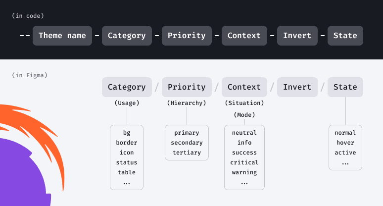
Token name is the same in both Figma and code, except for the theme/project name which is added to the token in the code.
For example, compare token for primary neutral background:
- in Figma:
bg/primary/neutral - in code:
--intergalactic-bg-primary-neutral
TIP
The token name doesn't have to contain all the elements of the naming structure. The naming structure creates a system so you can name the new token, and it will fit into the design system.
Tokens usage
Semantic tokens are context-specific, so they're used according to the intentions implied by their names:
bgtoken group for backgroundstexttoken group for text colorbordertoken group for strokes and bordersoverlaytoken group for overlays and faderscontroltoken group for all button-like controlsicontoken group for iconscharttoken group for chart components and gridsdate-pickertoken group for DatePickertabletoken group for tablestagtoken group for tags- etc.


Base tokens can be used for new elements and components which aren't in the Intergalactic Design System yet, but only if semantic tokens aren't suitable.

Creating new theme
Refer to the section in the common guide.